Where cool meets combustion in a split color palette
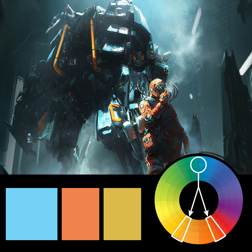
Artwork: Turquoise k*sh by Alex Alekseenko
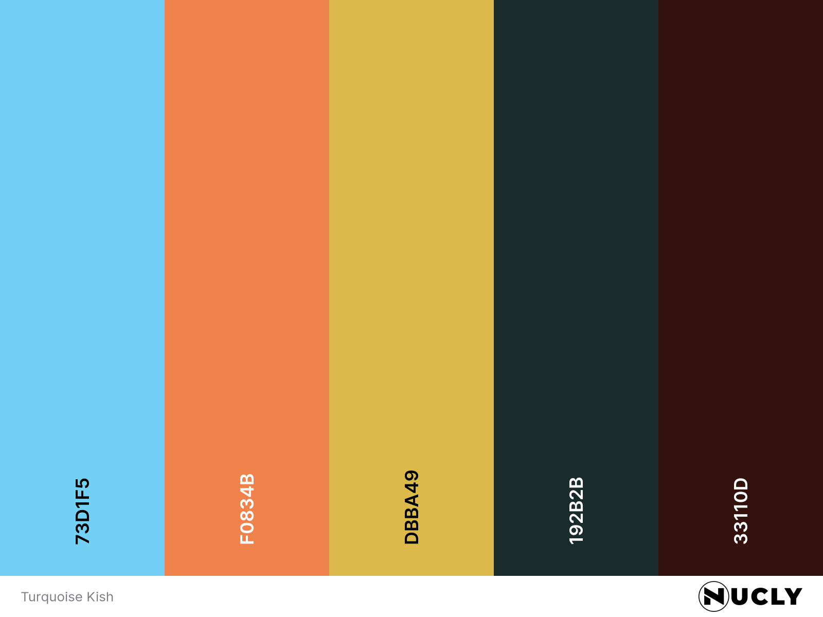
Color Harmony: Split Complementary
Key Color: Turquoise
Link to Palette: Colors on coolors.co
This concept piece draws the eye in instantly—not just with dramatic composition and atmosphere, but through deliberate color choices. Using turquoise as the key color, the image adds contrast through orange and yellow accents that guide your focus through the scene.
It's a textbook example of how color can do the heavy lifting in visual storytelling. The cooler tones give it a sense of isolation and scale, while the warm pops create urgency and life. Every element feels considered—even amidst the chaos.