Cyberpunk in Orange and Rain
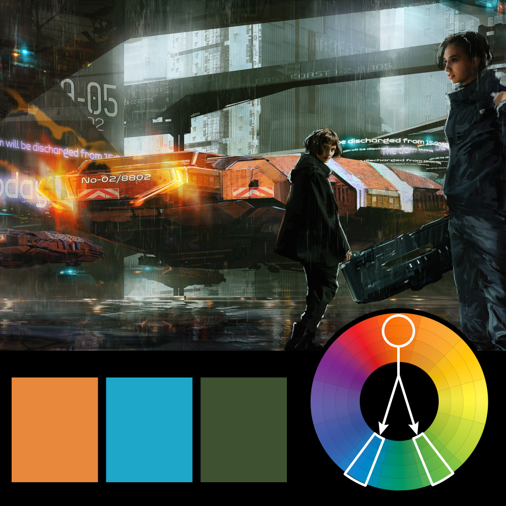
Artwork: Sci-Fi Concept Art — S Chiba
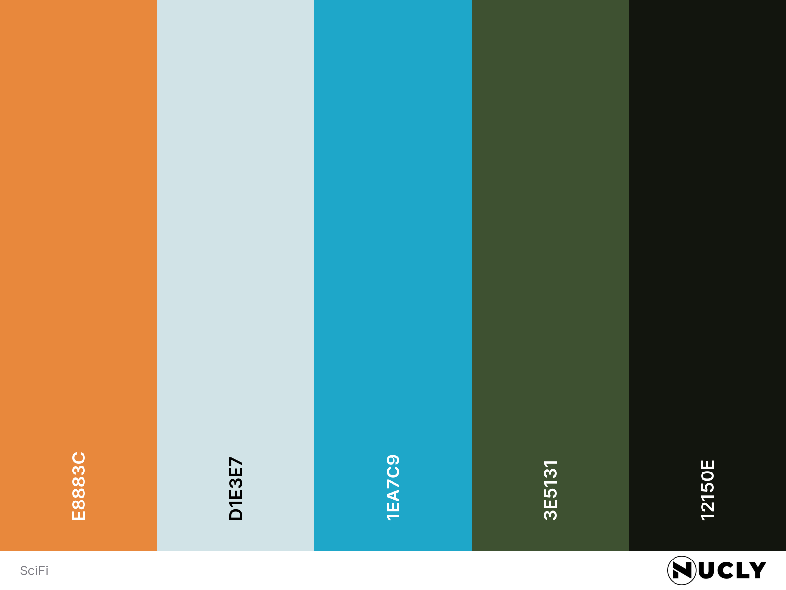
Color Harmony: Split Complementary
Key Color: Orange
Link to Palette: Colors on coolors.co
This sci-fi concept piece from S Chiba is a great example of making orange feel sophisticated. The orange lighting from the ship becomes the focal point, but it’s surrounded by restrained cyan blues and muted greens that keep the image grounded. Compared to something loud and saturated like last week’s Minions & Monsters poster, this palette feels controlled and cinematic.
The atmosphere does a lot of the work here. Rain, reflections, haze, and layered architecture all soften the contrast and let the color harmony settle into the world naturally. Even the bright orange never feels cartoonish because the surrounding tones constantly pull it back into balance. It’s still high contrast—just mature about it.