A Common Thread in a Different Color

Artwork: The 351 Books of Irma Arcuri by David Bajo
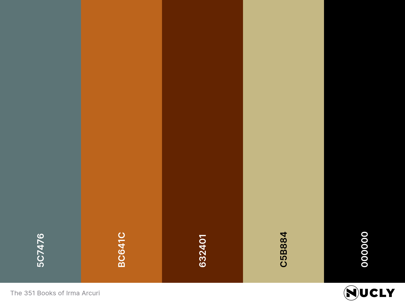
Color Harmony: Split Complementary
Key Color: Blue-Gray
Link to Palette: Colors on coolors.co
This cover has the difficult job of designing a book about books. The solution is wonderfully literal: a page from Don Quixote, holes punched through the story, and a ribbon threading its way through them. Even better, these aren't arbitrary choices. Don Quixote figures into the novel, the books themselves have been altered, and a common thread connects them all.
Then there's the color. The ribbon moves through warm copper tones before suddenly turning blue-gray at the bottom. It shouldn't feel like the same ribbon, but it does. The muted palette, consistent texture and lighting hold it together even as the hue changes dramatically. It's a great example of a cover where the concept, composition and color are all telling the same story.