Three Colors, Maximum Intensity
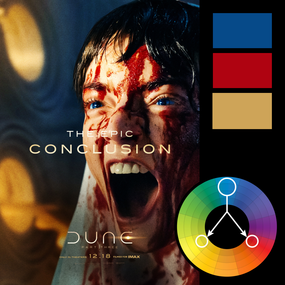
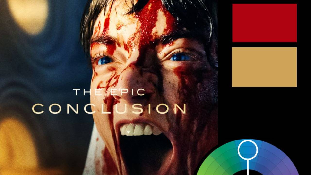
Artwork: Dune: Part Three Movie Poster
Color Harmony: Triadic
Key Color: Blue
Link to Palette: Colors on coolors.co
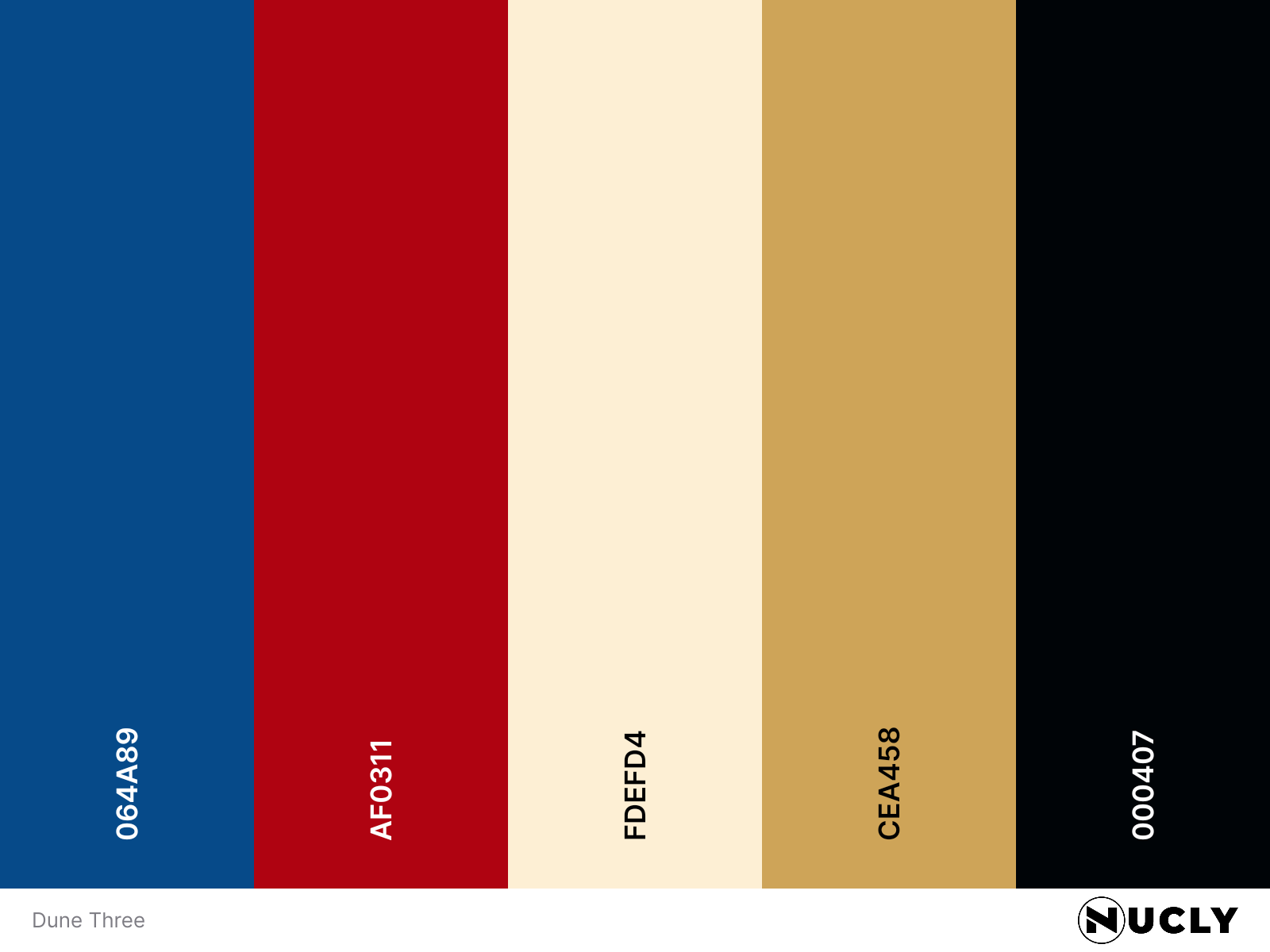
The poster for Dune: Part Three takes a very different approach from the near-monochromatic palettes of the previous films. This one leans heavily into a triadic harmony, with deep blue in the shadows, saturated red in the blood, and warm yellow in the highlights. Rather than letting one color dominate and using the others as accents, all three get their own space and plenty of saturation.
The result is a much more aggressive, visceral image. The tight crop and screaming expression do most of the storytelling, but the color pushes the intensity even further. It's a good example of how changing the color harmony can dramatically change the emotional tone of a design, even within an established visual franchise.