Making the Surreal Feel Real
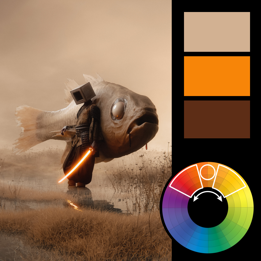
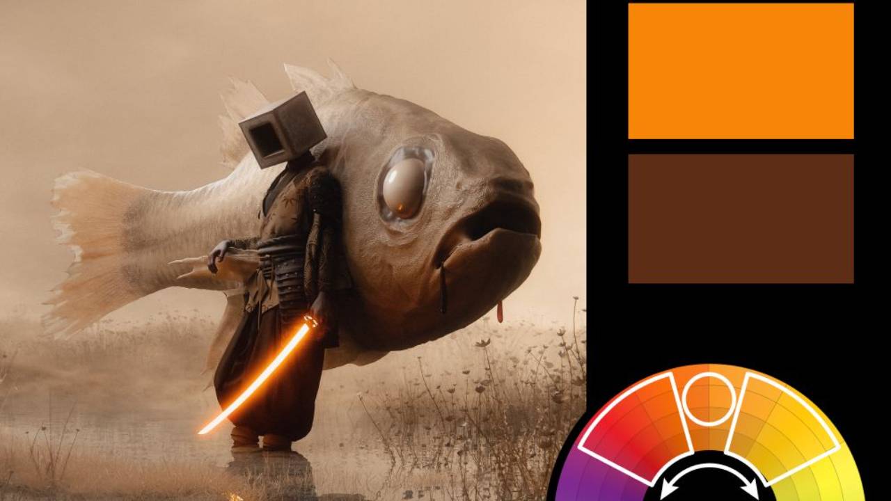
Artwork: Warden of the Mire by Huleeb on ArtStation
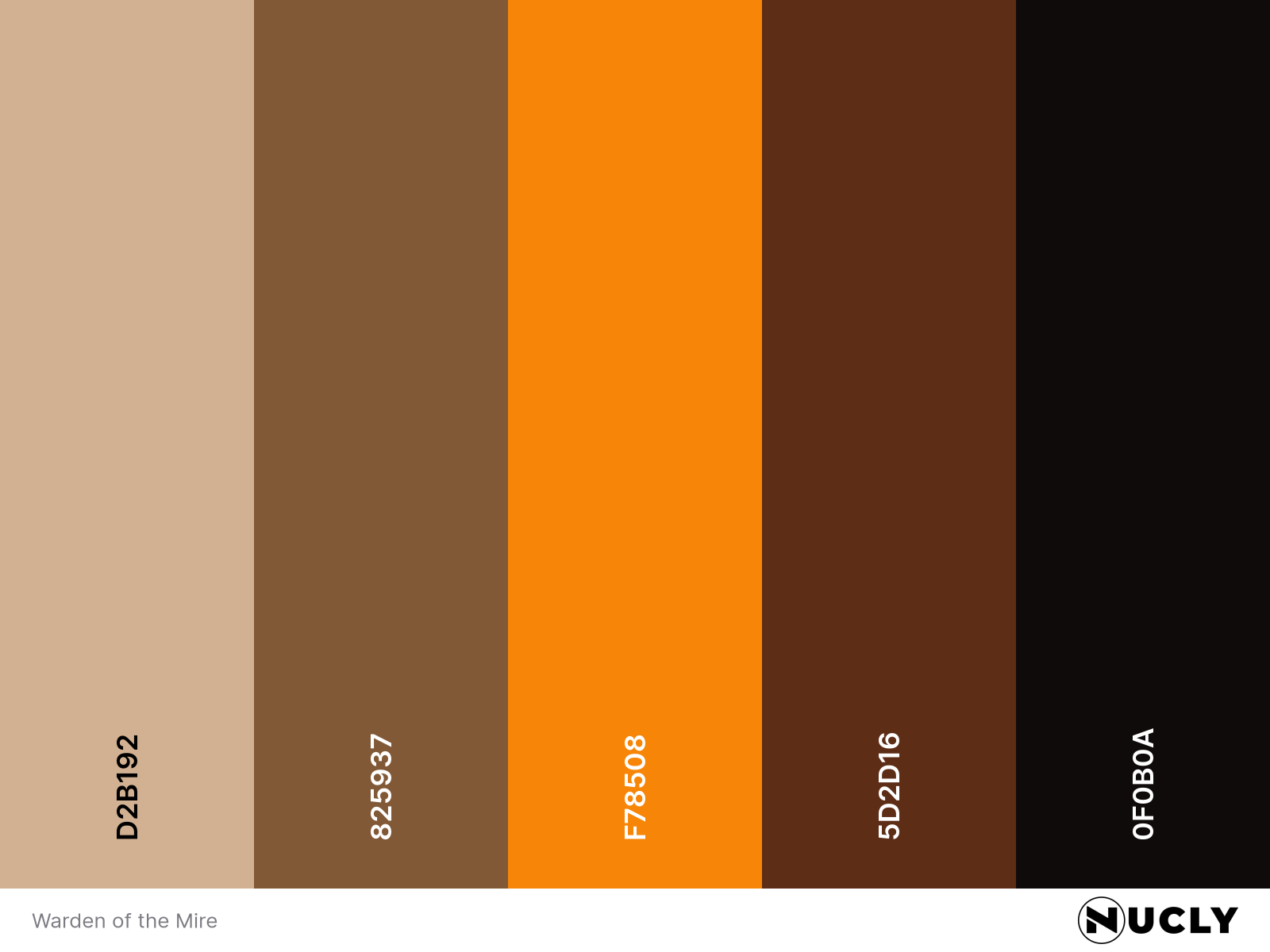
Color Harmony: Analogous
Key Color: Orange
Link to Palette: Colors on coolors.co
Warden of the Mire uses an analogous harmony, moving from pale yellow through orange into deep reddish-brown. Almost the entire image is heavily desaturated, with one exception—the glowing orange sword. That small area of saturated color becomes the focal point, giving the composition a much stronger visual anchor.
The concept itself is wonderfully surreal. A lone warrior leaning against an enormous fish through a barren landscape. But the lighting, shadows, reflections and atmospheric haze are so well executed that the scene feels surprisingly real. It's a great reminder that even the strangest concepts can feel believable when the execution is convincing.