The Art of Suggesting More Than You Show
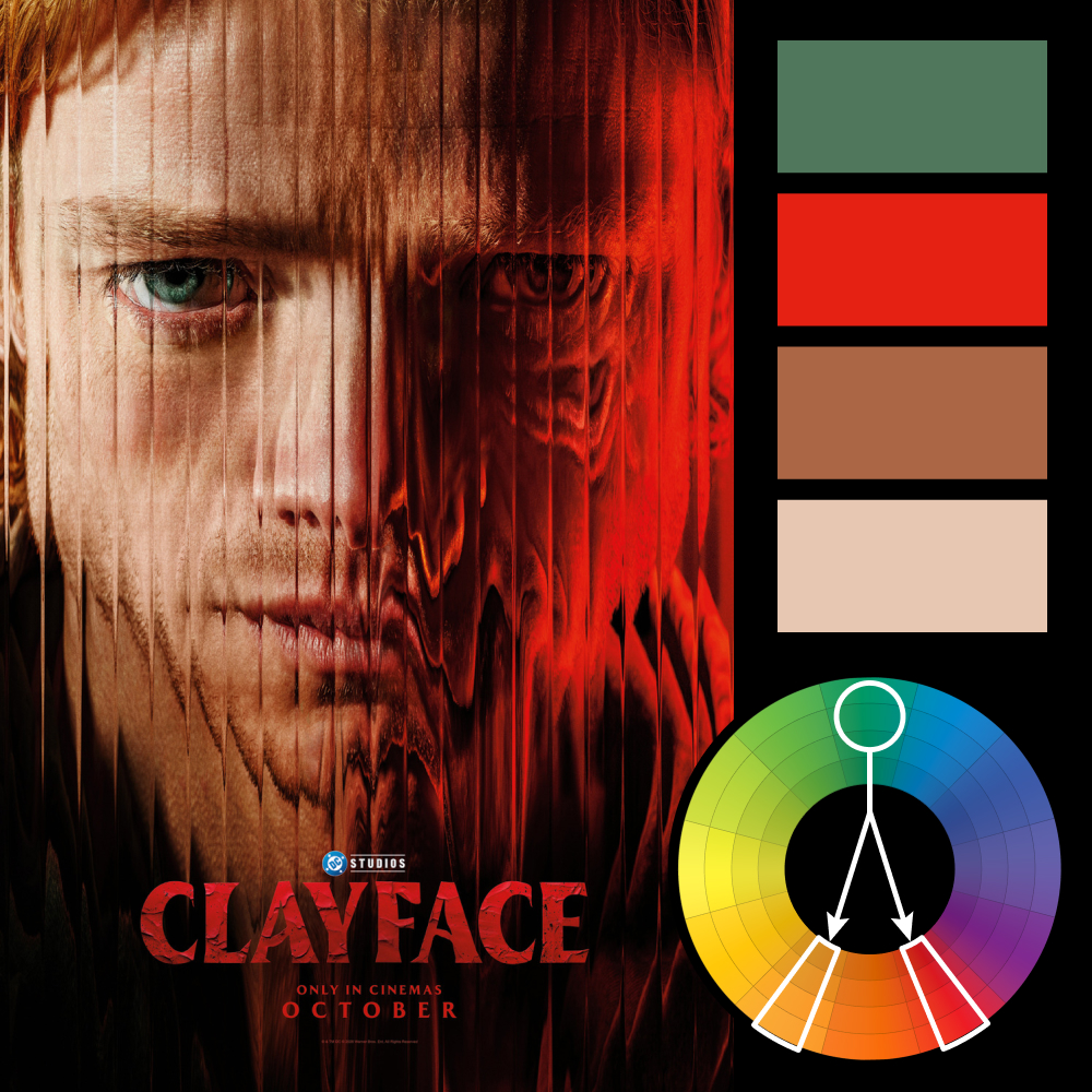
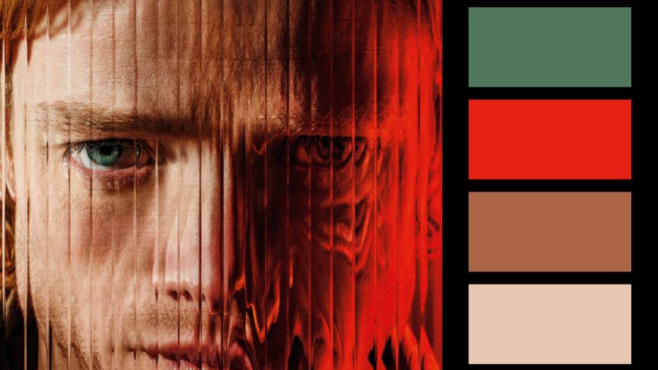
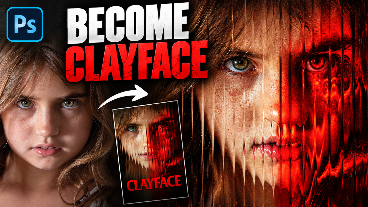
Artwork: Clayface Movie Poster
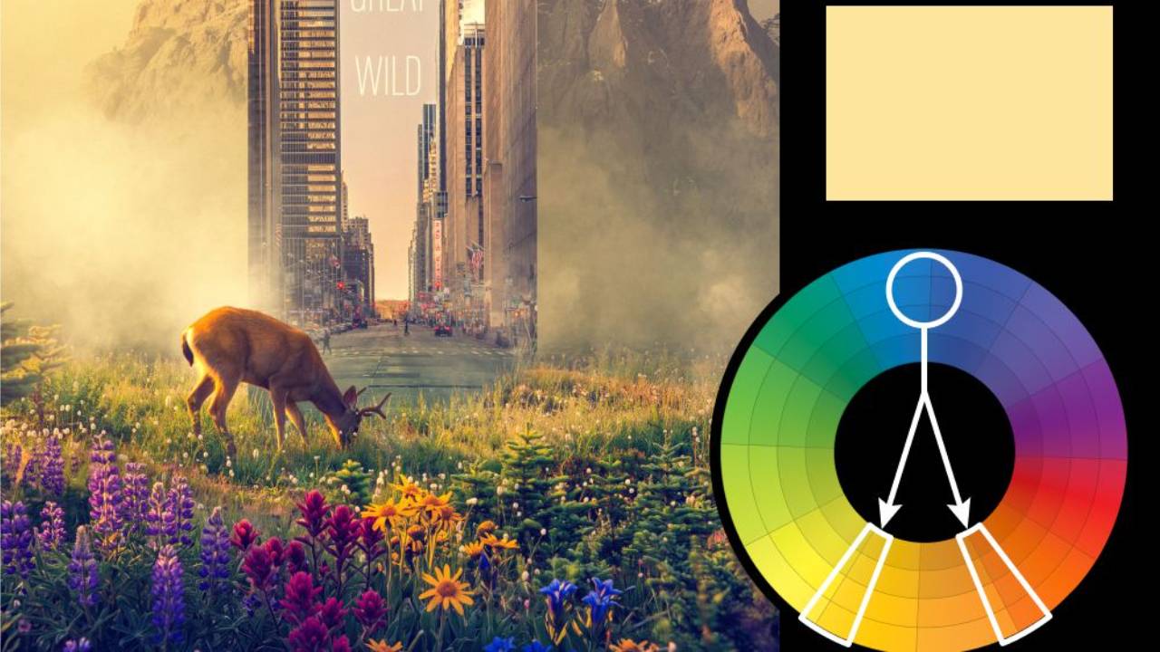
Color Harmony: Split Complementary
Key Color: Blue-Green
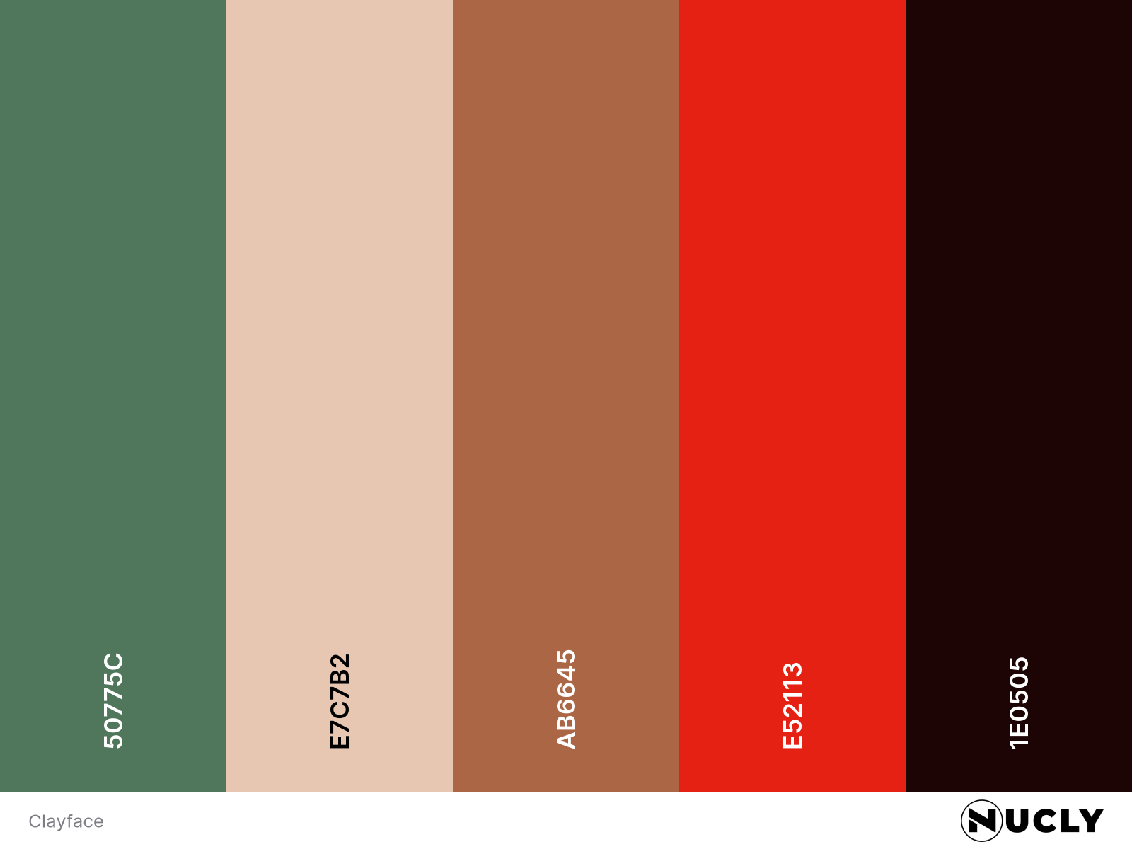
Link to Palette: Colors on coolors.co
The poster for Clayface uses a split complementary harmony, with the blue-green of the eye contrasting against the warm oranges and intense reds that dominate the image. The cooler eye becomes a natural focal point, drawing our attention into an otherwise heavily distorted portrait.
What makes this poster particularly clever is how it communicates the character's mutation without actually showing it. The familiar distortion of textured glass becomes a visual metaphor for something far more disturbing—the physical transformation of Clayface himself. It's a simple technique that suggests something much more complex, and arguably one of the most effective posters I've seen for the film.