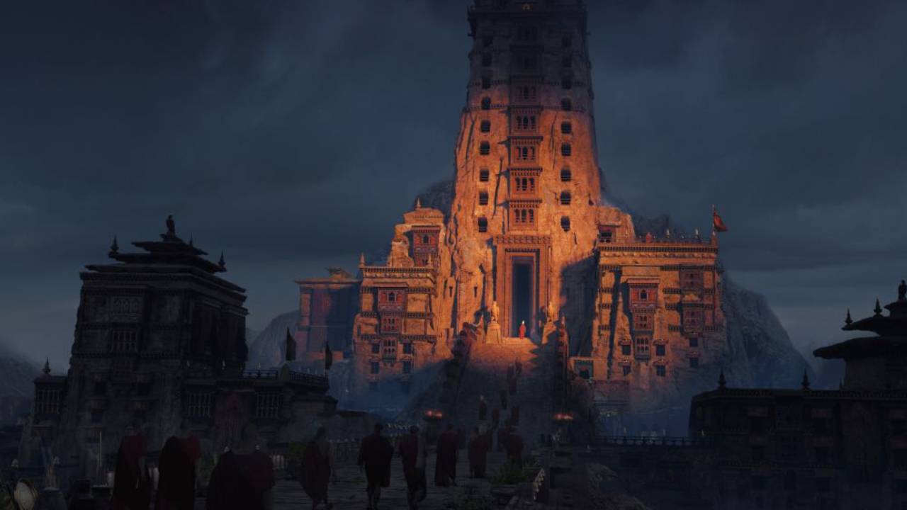
A Little Light Goes a Long Way
Artwork: Apostles of the Phoenix by Oliver Guiney
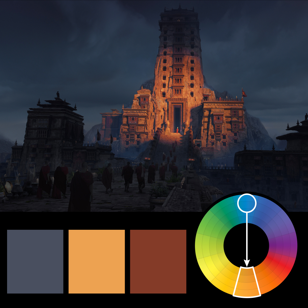
Color Harmony: Complementary
Key Color: Blue
Link to Palette: Colors on coolors.co
This artwork uses a complementary harmony, contrasting a desaturated blue in the shadows with the warm orange and red of the sunlit architecture. What's particularly interesting is how little light is needed to make the scene work. Most of the image remains in deep shadow, while a narrow band of warm sunlight reveals the intricate details of the central structure.
That contrast does more than establish a focal point. It creates a tremendous sense of depth, separating the illuminated temple from the darker buildings in the foreground. It's a great reminder that sometimes the most effective use of color isn't about adding more, but being selective about where you put it.