When Familiar Becomes Fascinating
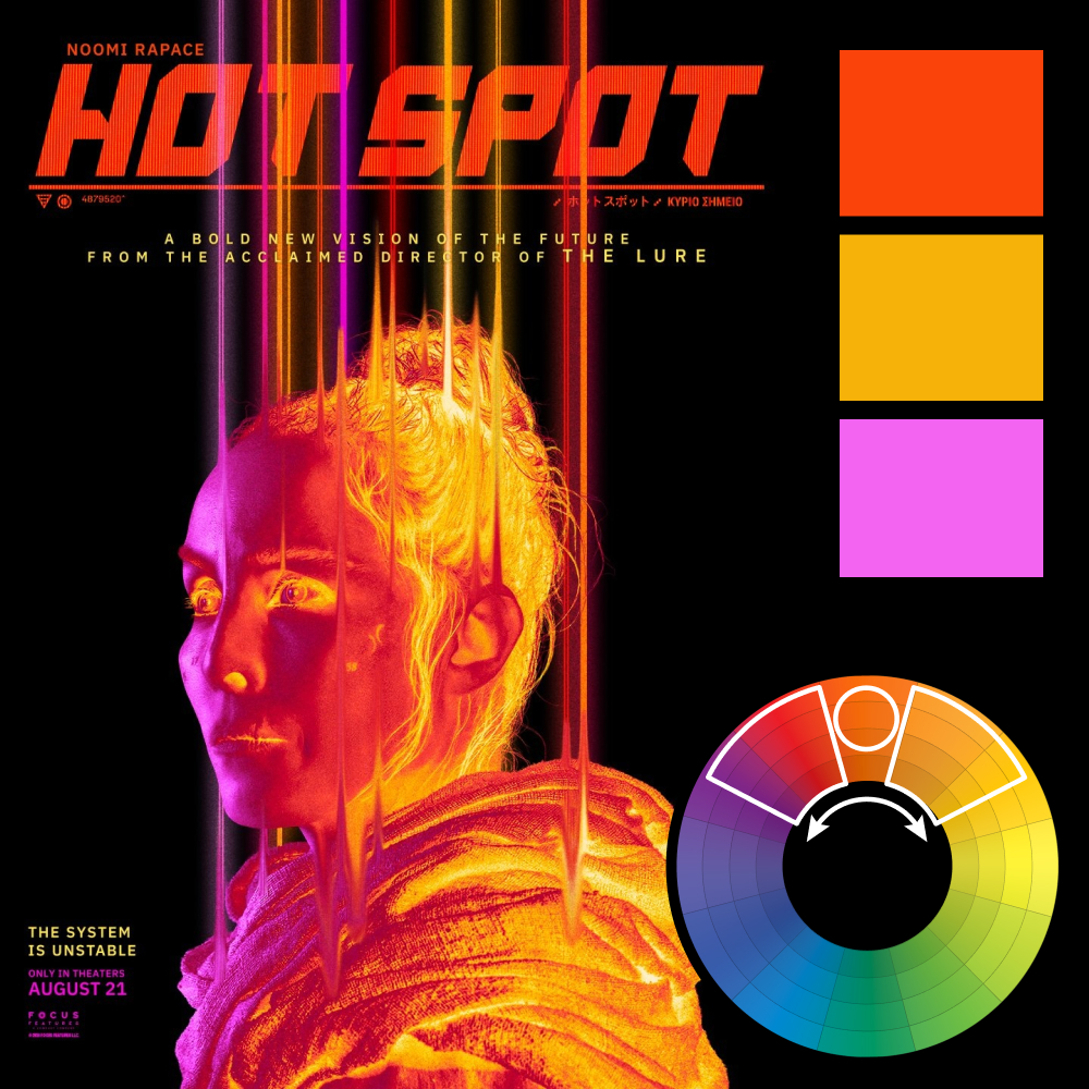
Artwork: Hot Spot Poster
Color Harmony: Analogous
Key Color: Orange
Link to Palette: Colors on coolors.co
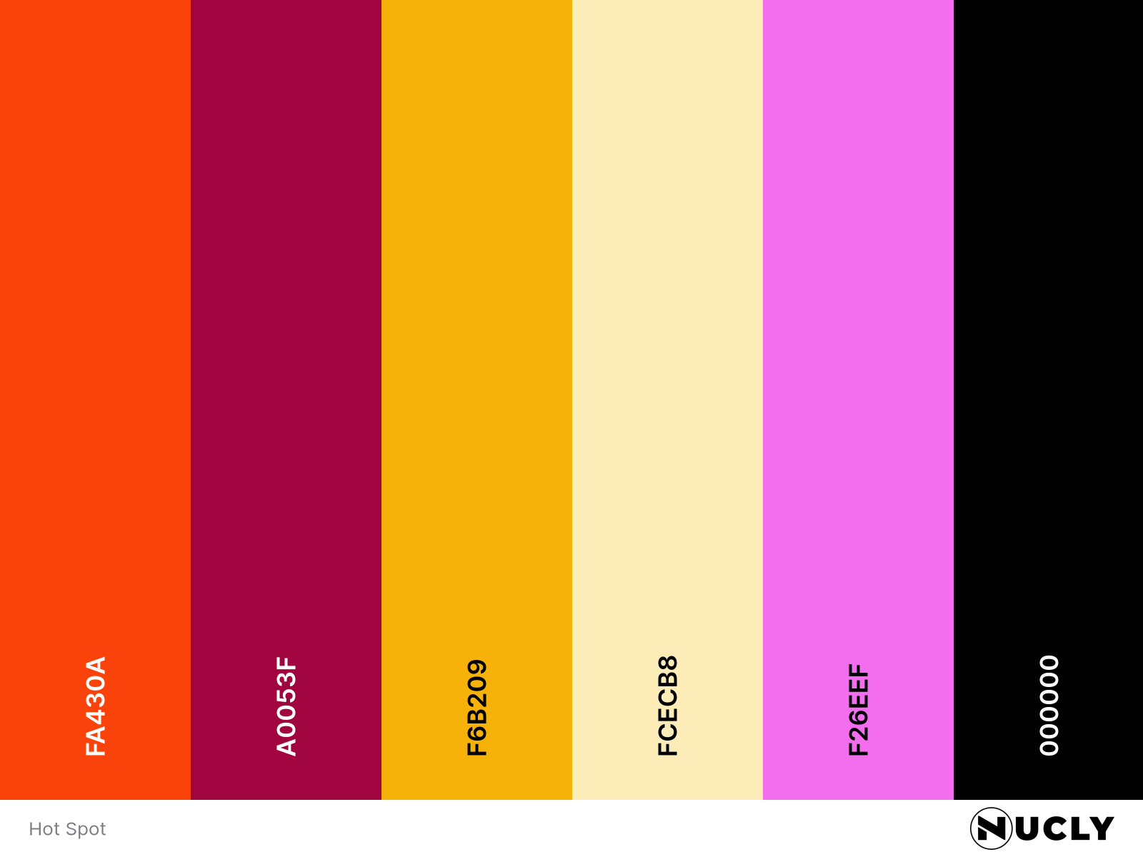
The poster for Hot Spot uses an analogous harmony stretching from lavender through a fiery orange into bright yellow. The warm orange sits at the center of the palette, bridging the cooler magenta tones with the intense yellow highlights. It's a simple harmony, but one that's pushed almost to its limit.
What makes the poster memorable isn't the color—it's the treatment. At its core, this is just a character portrait. But the vertical streaks and thermal-like lighting transform it into something unfamiliar. It isn't simply a heat-map effect. It feels like you're seeing the character through an entirely new lens, and that's often the difference between an image that's technically good and one that's genuinely intriguing.