A Loud Palette That Still Works
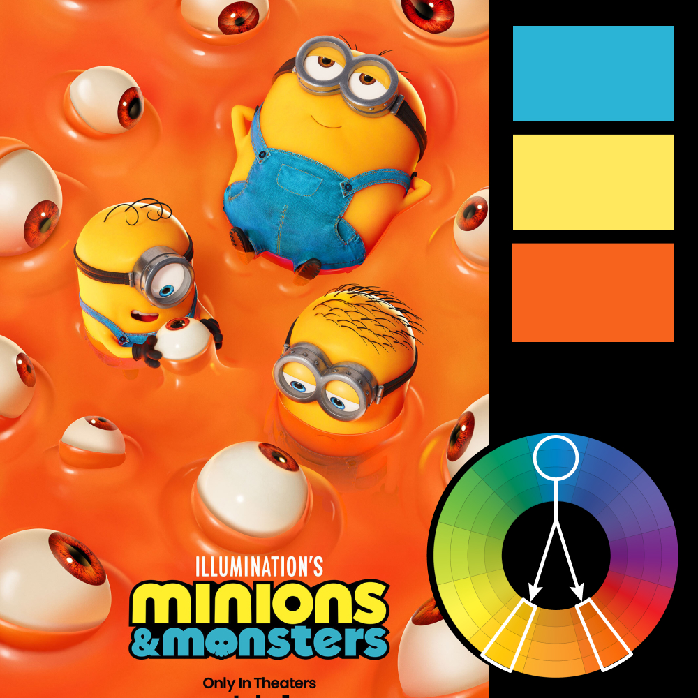
Artwork: Minions & Monsters Poster
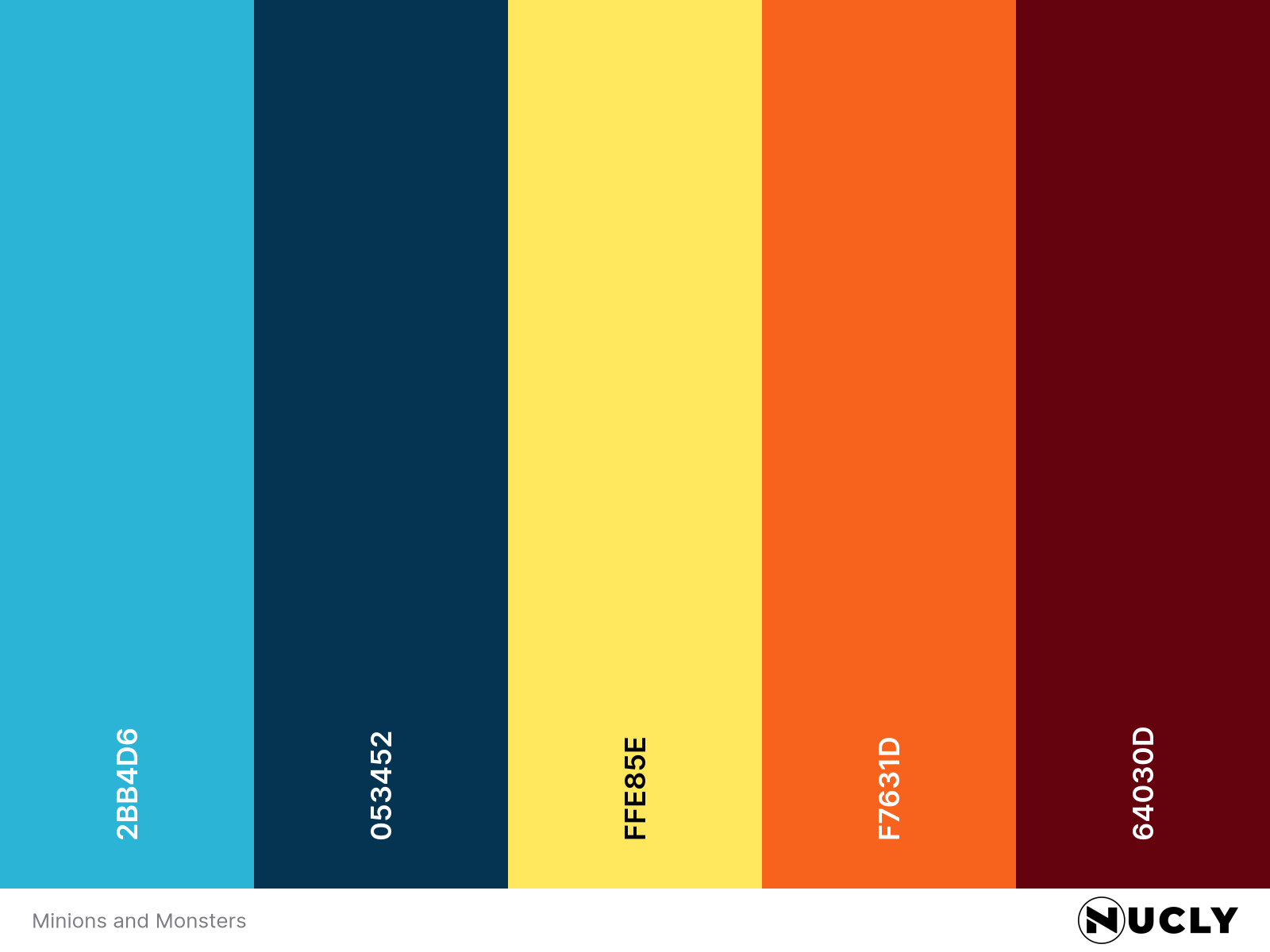
Color Harmony: Split Complementary
Key Color: Cyan Blue
Link to Palette: Colors on coolors.co
The Minions & Monsters poster uses a split complementary setup built around the cyan blue of the overalls. That color immediately stands apart because almost everything else in the image lives in warm territory—bright orange slime, yellow characters, and red-orange eyes floating through the background. The result is loud, playful, and impossible to ignore.
What keeps it working is the balance. The blue only really appears in a few key places, but that’s enough. Your eye jumps straight to the characters because the palette is doing the hierarchy for you. Even with all the chaos in the frame, the composition stays readable because the strongest contrast is concentrated right where it needs to be.