The Relationship Between Subjects
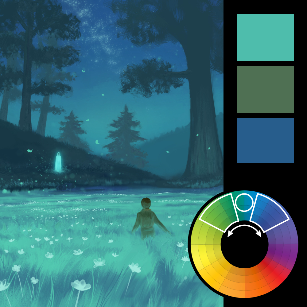
Artwork: Fields of Grace — Ali (ArtStation)
Color Harmony: Analogous
Key Color: Cyan
Link to Palette: Colors on coolors.co
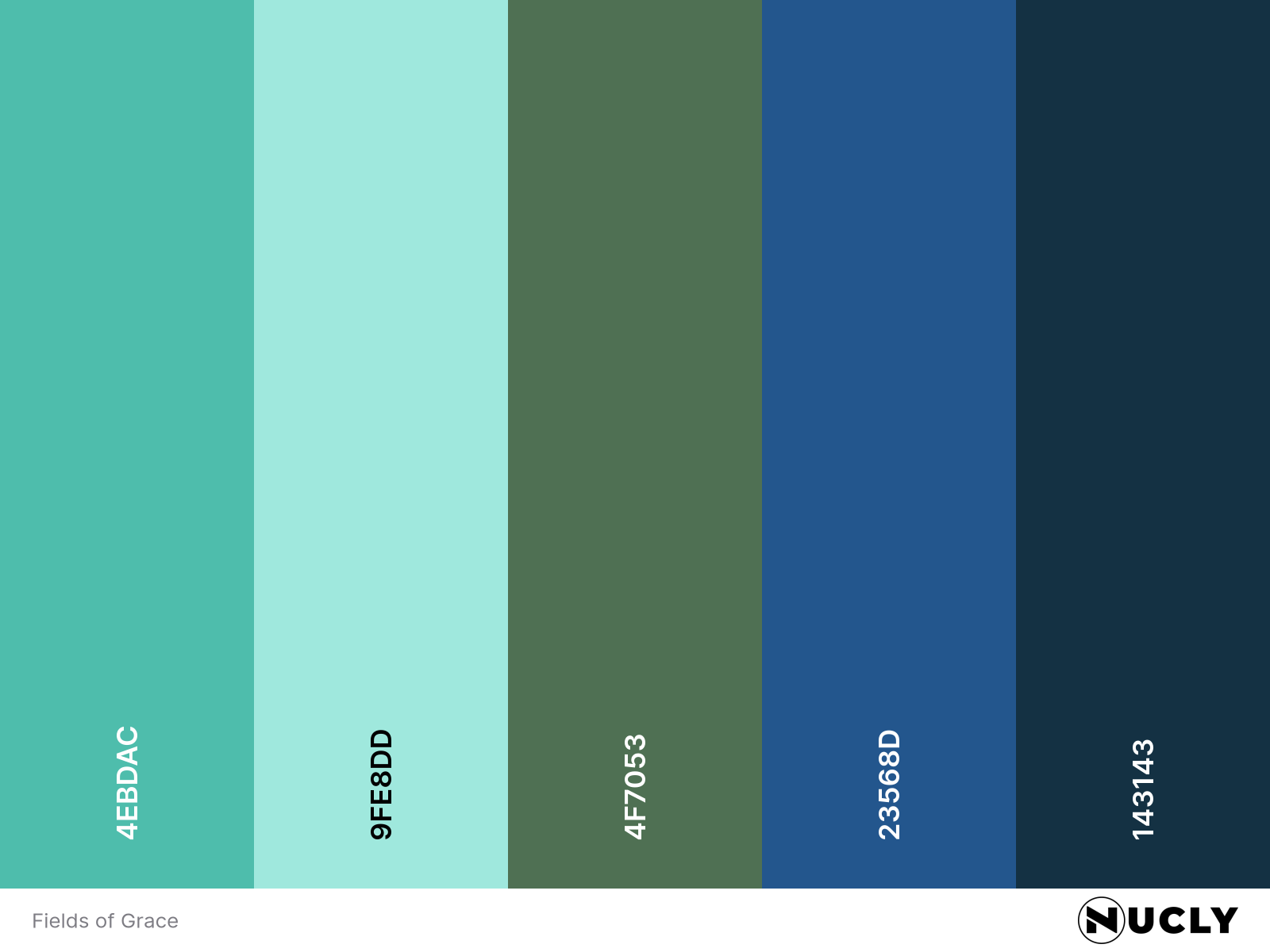
Fields of Grace uses an analogous harmony built around cyan, shifting into blue and green. It's a restrained palette that lets the lighting become the star. Rather than relying on moonlight, the scene is illuminated from within by glowing flowers and a distant figure, giving the landscape an almost dreamlike quality.
Just as important is the relationship between the two subjects. Whenever you have multiple subjects in a piece, the viewer should immediately understand how they relate to one another. Here, there's no ambiguity. The child is moving toward the glowing figure, creating an instant sense of curiosity and story. The lighting and composition work together to guide your eye through that relationship.