When One Percent Is Enough
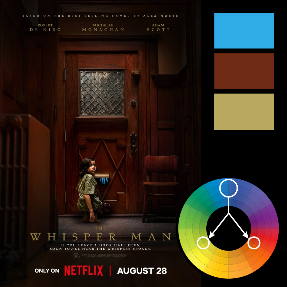
Artwork: The Whisper Man Poster
Color Harmony: Triadic
Key Color: Burgundy / Brown
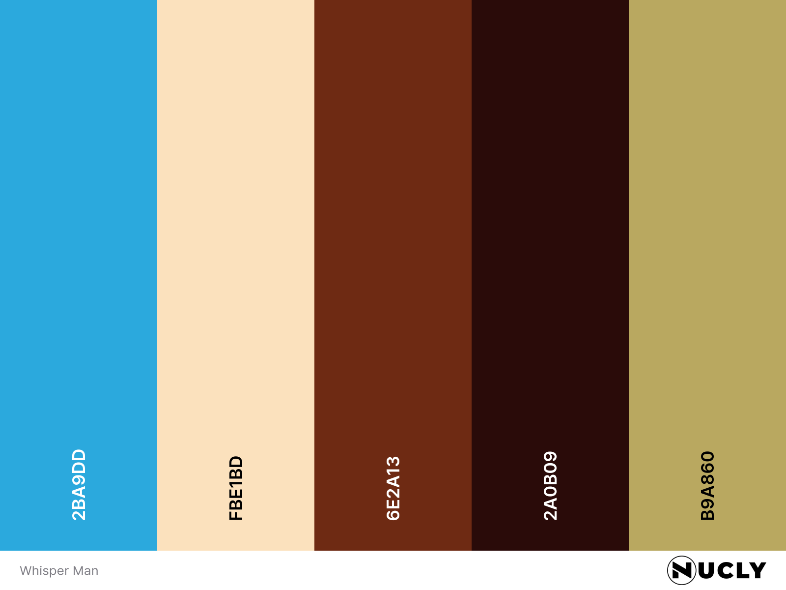
Link to Palette: Colors on coolors.co
The poster for The Whisper Man is a great example of using a triadic harmony with restraint. The deep burgundy-brown dominates nearly the entire image, while the muted olive title provides the second point of the triangle. The third color—a saturated blue—appears only in the fingers reaching through the mail slot. It's tiny, but it's the first thing your eye notices.
That's one of the strengths of a triadic palette. It lets one color do almost all the work while the other two become accents. Here, the blue occupies less than one percent of the poster, yet it completely changes the composition. It doesn't need to be bigger. It just needs to be different.