When Color Gets Too Close for Comfort
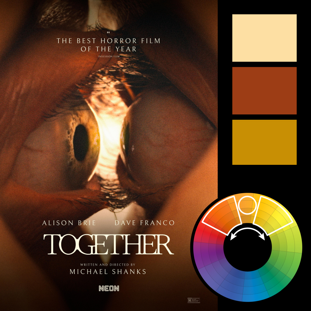
Artwork: Together Movie Poster by Bianca Moran Parkes
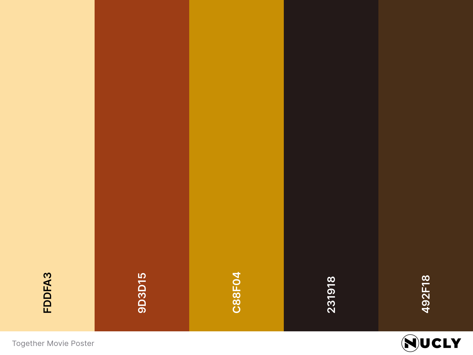
Color Harmony: Analogous
Key Color: Ochre/Golden Yellow
Link to Palette: Colors on coolors.co
This one’s hard to look away from—and harder to look at. Bianca Moran Parkes' poster for the upcoming horror film Together grips the viewer with an uncomfortably tight crop of two eyes locked in a haunting stare. It’s claustrophobic, unsettling, and undeniably effective.
The poster uses a warm analogous harmony built almost entirely from shades of ochre, burnt orange, and flesh tones. That limited palette heightens the tension by drawing your attention to texture and contrast rather than color variation. The only cool tone—a tiny glint of green in the iris—disrupts just enough to make you squirm. It’s a brilliant study in how proximity and restraint in palette can intensify emotion.