When Color Contrast Takes a Back Seat

Artwork: The Lone Knight by Huleeb (ArtStation)
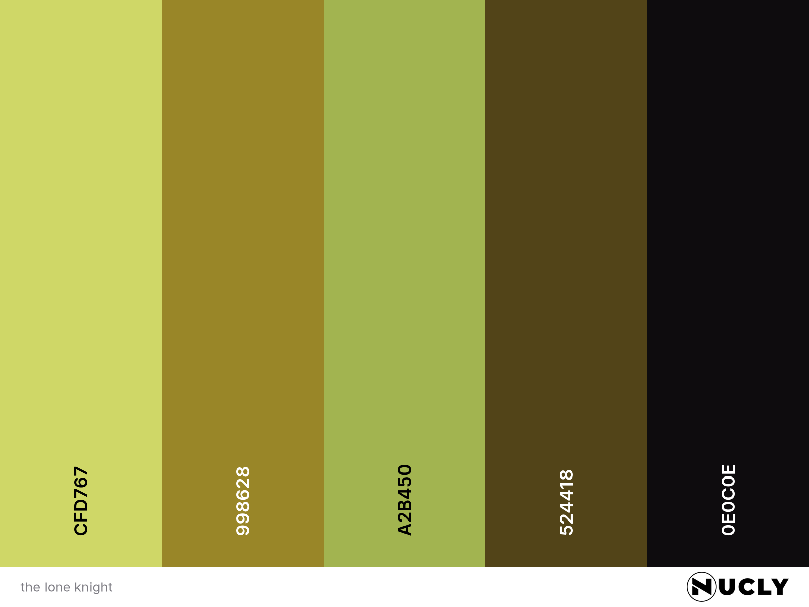
Color Harmony: Analogous
Key Color: Yellow-Green
Link to Palette: Colors on coolors.co
This is a masterclass in contrast—of everything except color. The tones shift from bright skies to deep shadows. The detail moves from the silhouette’s armor to the soft blur of grass. But the color stays tightly held within an analogous harmony of yellow-greens.
That’s what makes the tiny shifts matter. The ever-so-slight warmth in the shadows. The faint lean into blue-green in the clouds. These subtle pushes at the edges of the spectrum keep the image from falling flat. It’s not just harmonious—it’s controlled. And that restraint is what makes the scene so haunting.


