When a Movie Poster Becomes a Romance Novel
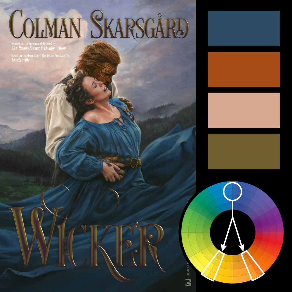
Artwork: Wicker Movie Poster
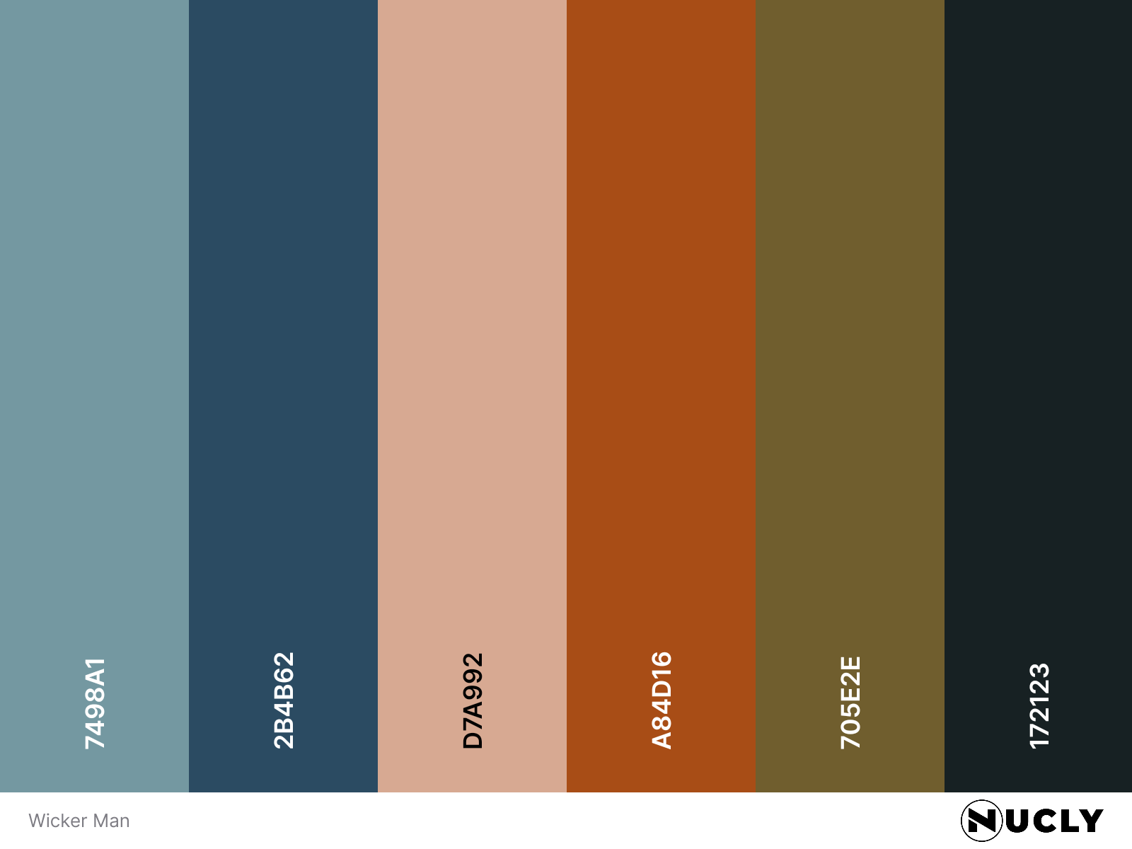
Color Harmony: Split Complementary
Key Color: Blue
Link to Palette: Colors on coolors.co
The poster for Wicker takes an interesting approach to movie marketing, borrowing the look of a traditional Fabio-era airport romance novel cover. From the dramatic embrace and flowing dress to the ornate gold typography, nearly every element feels deliberately pulled from that genre. It's a clever way to establish a visual identity that stands apart from the typical movie poster.
The color palette reinforces that aesthetic with a split complementary harmony. The deep blue dress dominates the composition, contrasted against warm oranges and browns in the characters and a muted golden yellow in the typography. The colors are relatively desaturated, giving the image a painterly, vintage quality that helps sell the illusion of an old-fashioned romance novel cover.