What’s Waiting Upstairs?
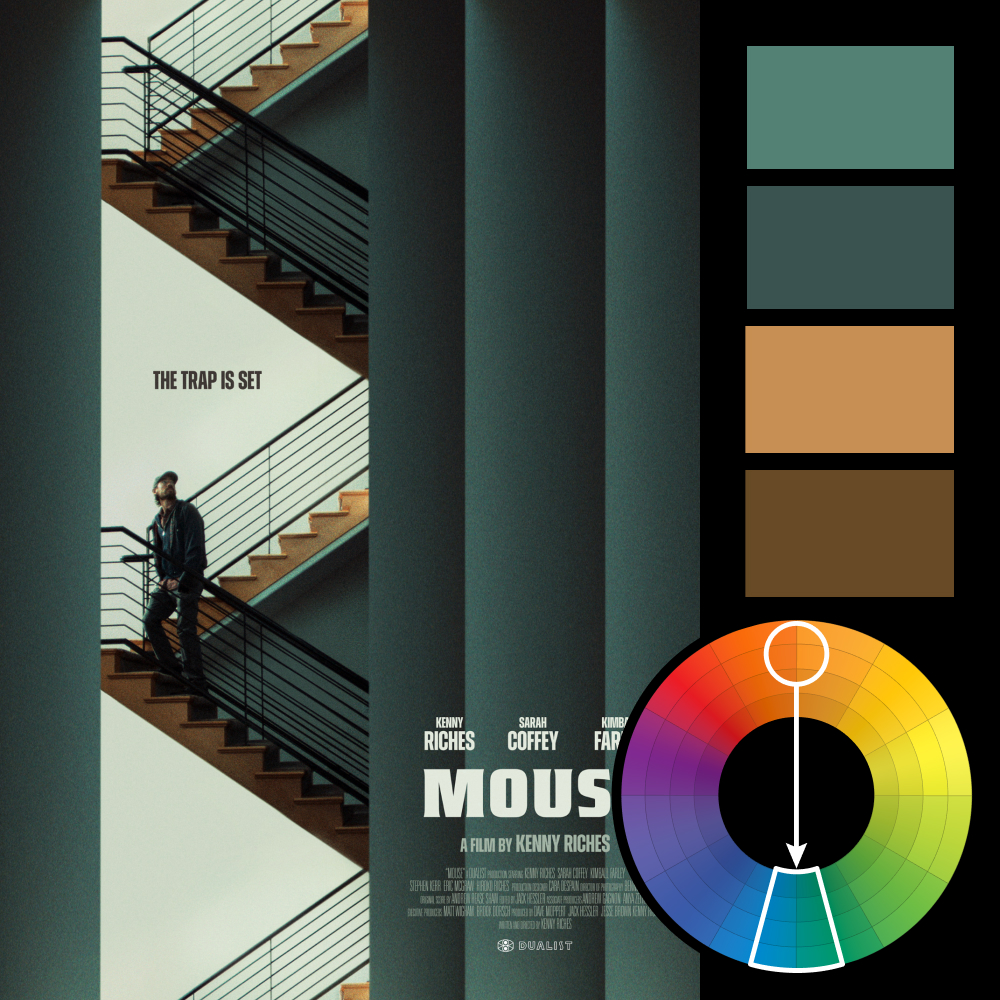
Artwork: Mouse Poster by Eileen Steinbach
Color Harmony: Complementary
Key Color: Teal
Link to Palette: Colors on coolors.co
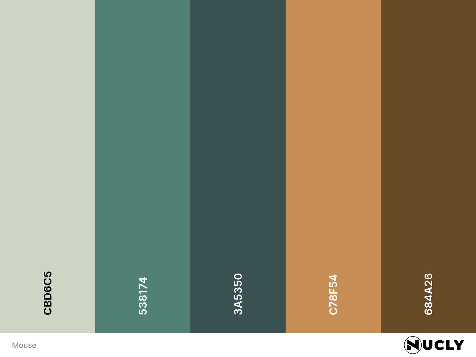
The poster for Mouse uses a complementary harmony with warm orange against a heavily desaturated teal. Keeping both colors muted gives the palette a much more restrained feel, while the orange stairs create just enough contrast to break up all that teal.
But the stronger contrast here is actually in the detail. Most of the poster is made from huge, simple shapes—the walls, columns and negative space. That makes your eye go straight to the one area with lots of detail: the man climbing the stairs. And because he's looking up, your eye follows his. You know something is waiting above him, even though the poster doesn't show you what.