Two Nighthawks Looking for Love
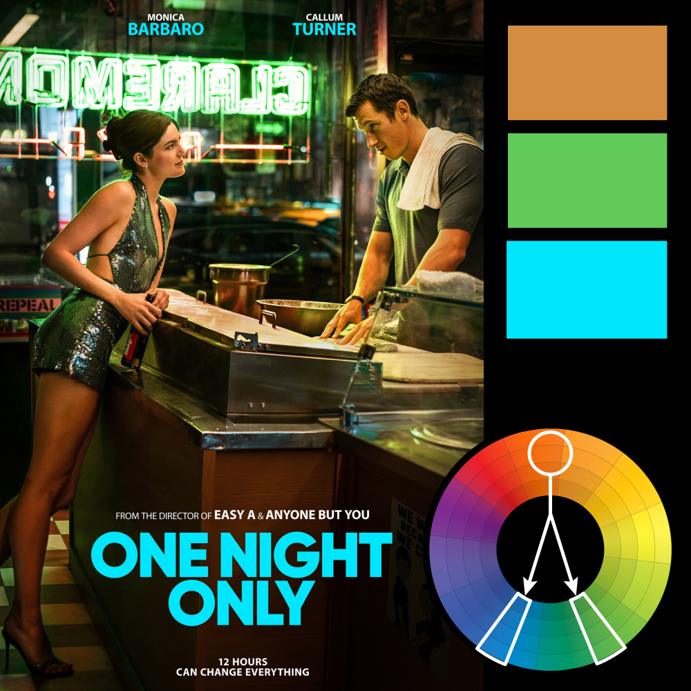
Artwork: One Night Only Poster
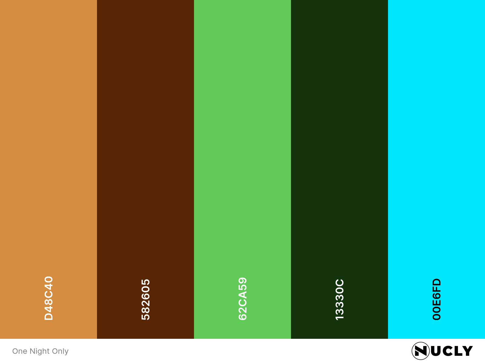
Color Harmony: Split Complementary
Key Color: Orange
Link to Palette: Colors on coolors.co
This poster for One Night Only leans into a classic split complementary setup. The warm orange base sits across the counter, skin tones, and interior light, while the neon green sign and wardrobe push in from one side and the cyan type anchors the other. It’s a tight palette, but the saturation is cranked just enough to make it feel stylized instead of natural.
That color treatment is what gives it the mood. Without it, this is just a still from a diner scene. With it, it starts to feel closer to something like Edward Hopper's Nighthawks—isolated, late-night, a little suspended in time. The composition keeps it simple: two figures, one counter, eye lines pulling across the frame. The color does the rest.