How to Design a Cinematic Film Poster Using Triadic Color Harmony
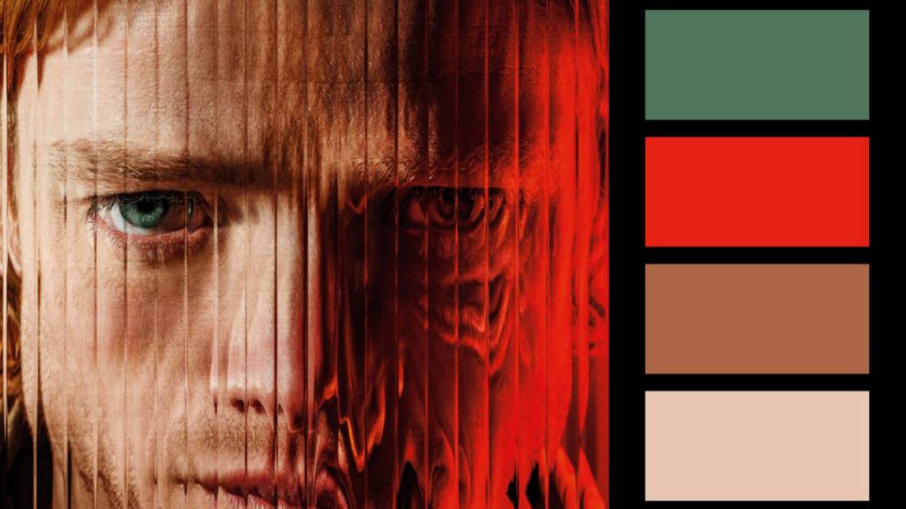
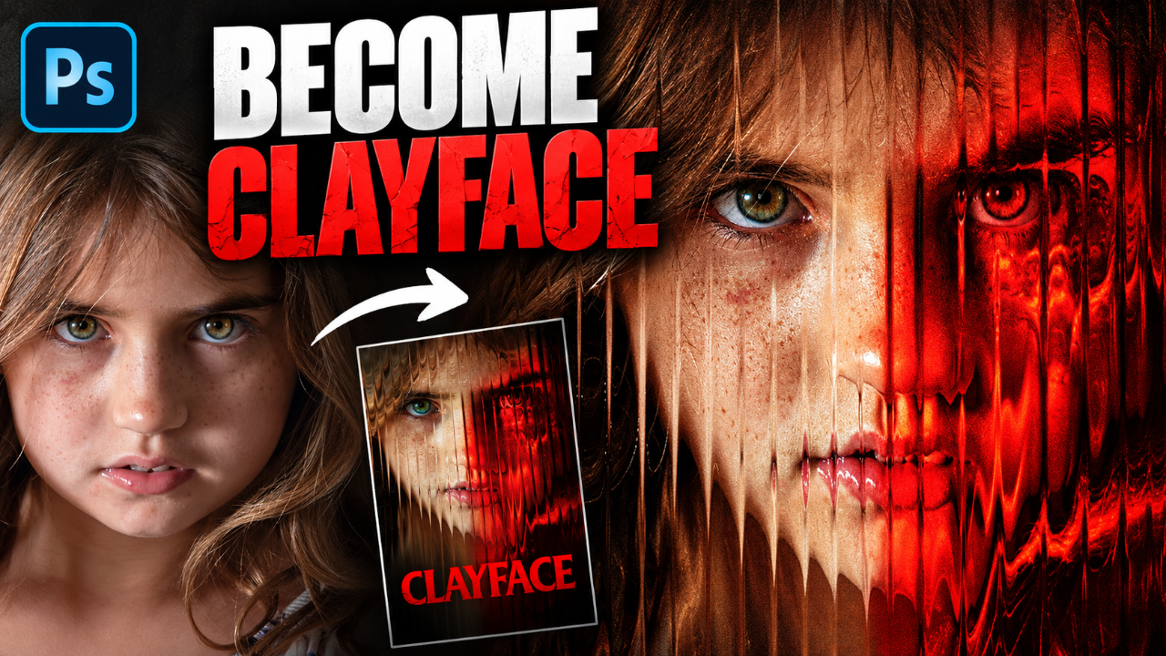
Want to make your photos look like they belong on a Hollywood movie poster? In this Photoshop tutorial, I'll show you how to transform an ordinary photograph into a cinematic film poster using one of the most powerful concepts in color theory: triadic color harmony.
Starting with a single stock photo, we'll straighten the composition, build dramatic lighting, create a balanced color palette, and design a professional-looking poster from scratch. Along the way, you'll learn techniques that can be applied to composites, digital art, photography, and cinematic color grading.
In this tutorial you'll learn:
- Using Camera Raw to correct perspective
- Creating cinematic lighting
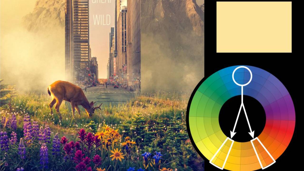
- Understanding triadic color harmony
- Professional color grading techniques
- Designing believable movie poster typography
- Making a simple image feel like a blockbuster film
📸 Josh Hild: https://unsplash.com/@joshhild If you enjoyed this tutorial, consider subscribing for more advanced Photoshop compositing, color grading, and cinematic artwork tutorials every week.
You can download all the assets for this tutorial here:
Note: If you are not yet a member of Nucly, you can access the downloads here.