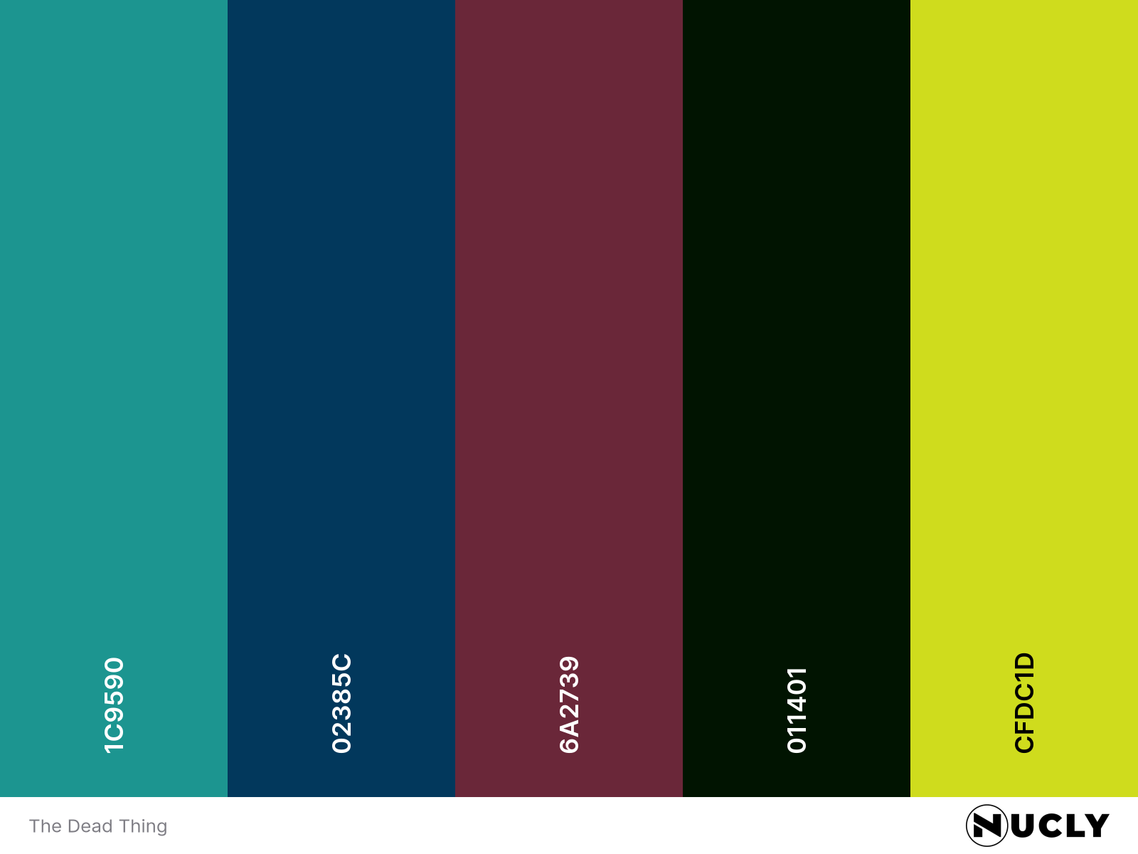
Triadic tension in teal
Artwork: The Dead Thing (Movie Poster)
Color Harmony: Triadic
Key Color: Teal
Link to Palette: Colors on coolors.co
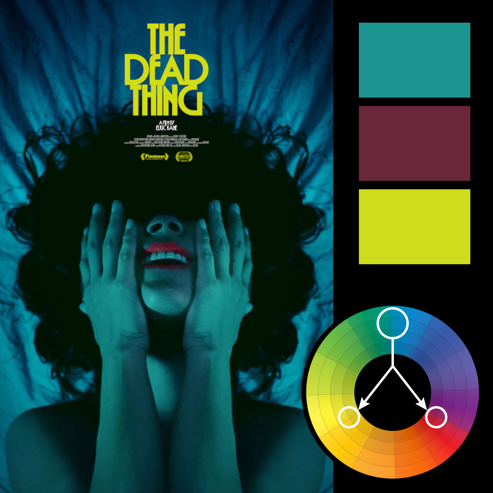
Nearly everything in this poster bathes in teal, creating an eerie, underwater kind of quiet. But it’s the subtle use of the other triadic hues—chartreuse yellow in the title and wine red in the lips—that snaps the whole thing into balance. The yellow feels almost sickly. The red, too vivid. But that’s the point—they aren’t meant to soothe. They’re meant to unsettle.
A perfect example of restraint used for impact. The palette is loud in theory, whispering in execution.