Red, White & Blue... Without Yellow
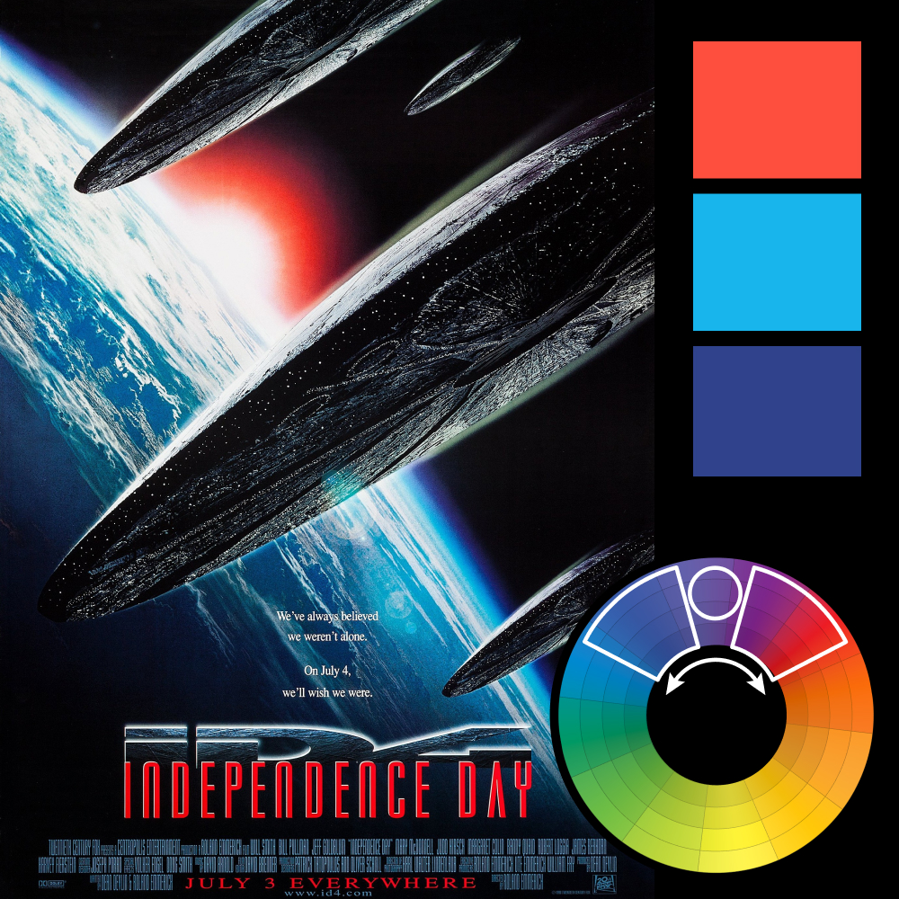
Artwork: Independence Day Poster
Color Harmony: Analogous
Key Color: Blue
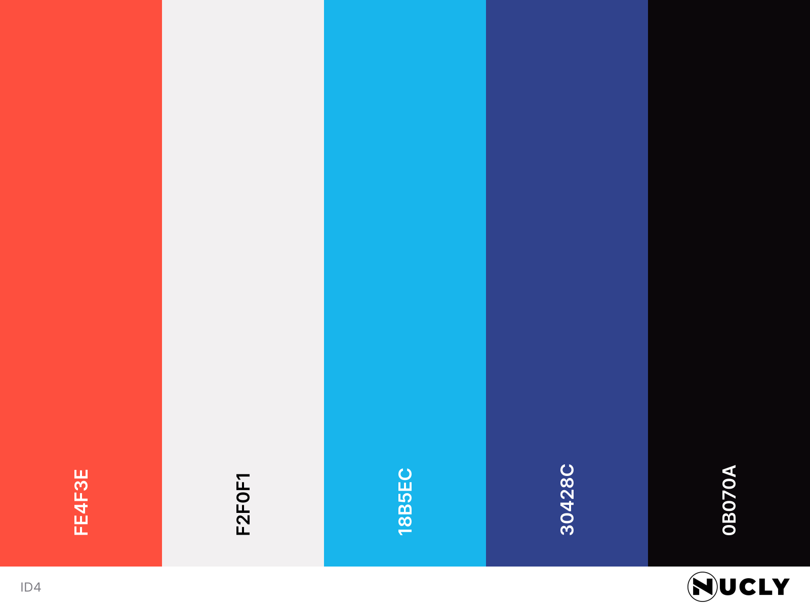
Link to Palette: Colors on coolors.co
With the Fourth of July around the corner, it seemed fitting to revisit the poster for Independence Day. At first glance, it feels like it should use a classic triadic harmony. When you combine blue and red, the natural instinct is to complete the triangle with yellow. The rising sun behind the Earth practically begs for it. Instead, the palette stays on one side of the color wheel, moving from blue through purple into red.
That missing yellow changes the entire feel of the poster. Rather than completing the triangle, the designers let the harmony stand on its own. The result feels cleaner, more graphic, and—whether intentional or not—more distinctly red, white, and blue. In this case, the color harmony isn't just supporting the design. It has its own message: America 🇺🇸