Three Colors, Straight Out of the 90s
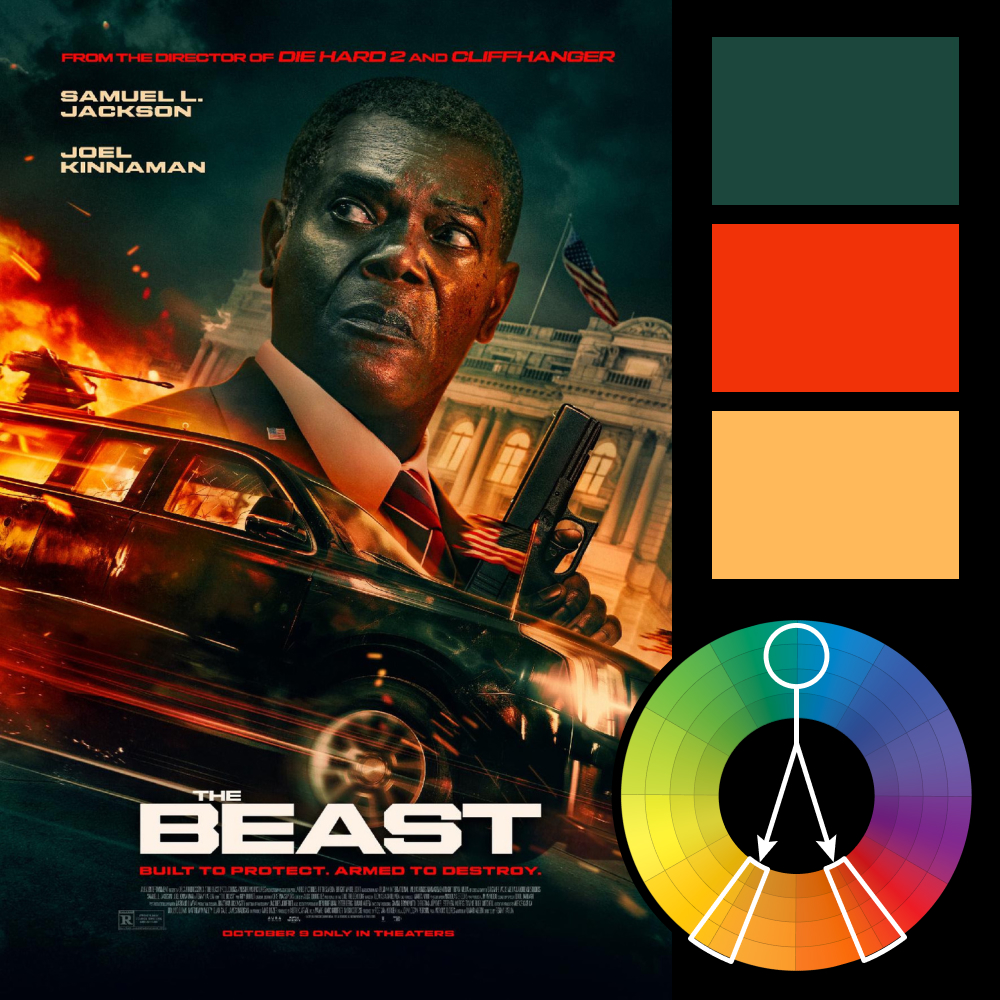
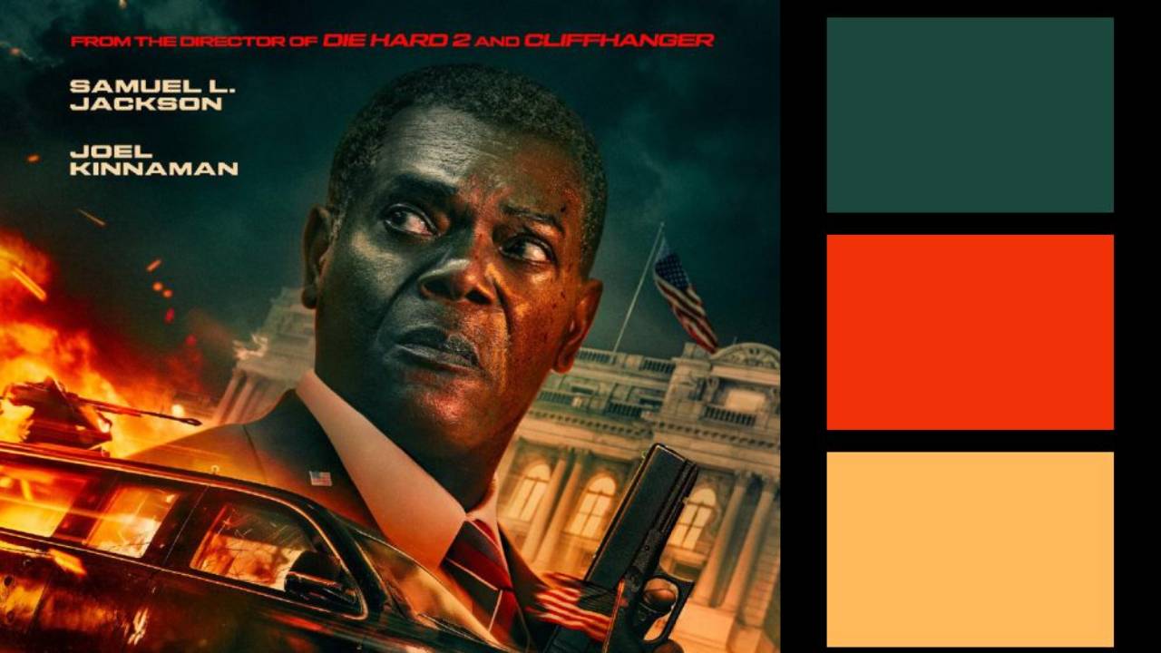
Artwork: The Beast Poster on ImpAwards.com
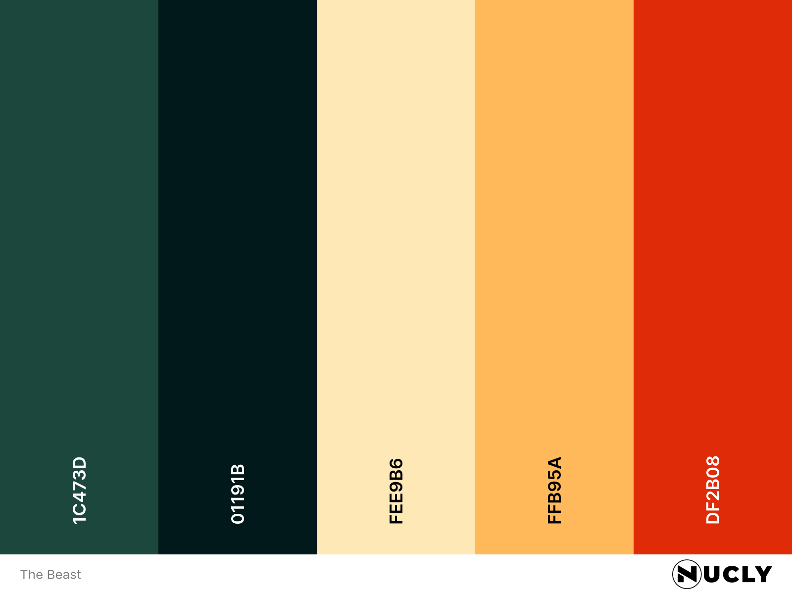
Color Harmony: Split Complementary
Key Color: Dark Teal
Link to Palette: Colors on coolors.co
The poster for The Beast uses a split complementary harmony with dark teal as the key, contrasted by warm yellow and bright red. But what really stands out is how aggressively the image is pushed into those three colors. It has an almost tritone look, with very little neutral color left in the image.
That treatment gives the whole poster a deliberate 90s action-movie feel. The tilted composition, oversized hero, speeding car, fire, blocky title—even the “from the director of Die Hard 2 and Cliffhanger” callout feels pulled from that era. The limited palette helps sell the throwback. It doesn't just color the poster; it helps date it.