This painting makes you look where it wants
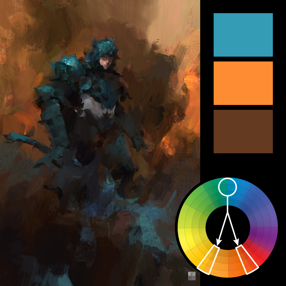
Artwork: Berserk by Vladimir Motsar
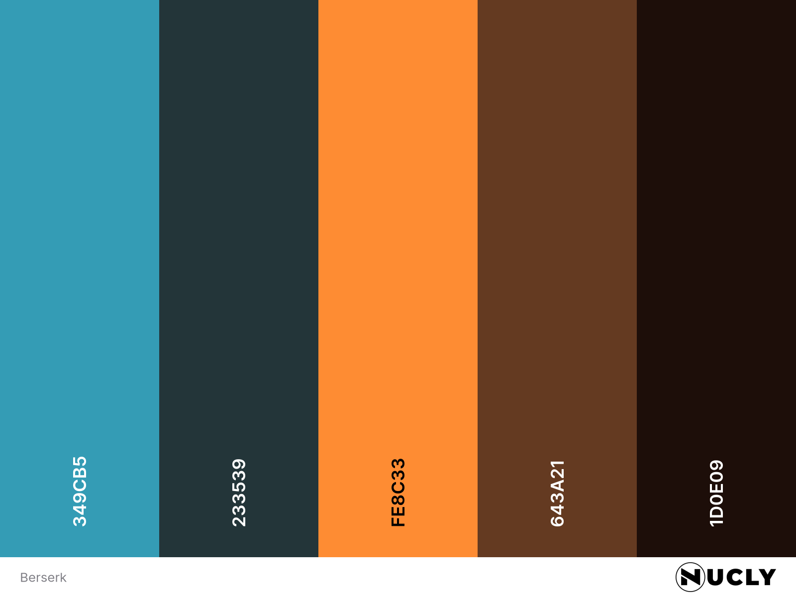
Color Harmony: Split Complementary
Key Color: Cyan Blue
Link to Palette: Colors on coolors.co
This week’s image is a digital painting titled Berserk by Vladimir Motsar. It’s a perfect study in the principle that detail should exist only where it matters. The face is painted with tight, almost photographic precision. Everywhere else? Large, gestural brushstrokes that read clearly but hold little actual detail.
The color palette follows a split complementary harmony, with cyan blue as the key color and rich orange and reddish browns as its complements. That cooler blue pulls the focus to the figure while the background glows with opposing warmth—adding energy and tension without stealing the spotlight.