The Illusion of Detail
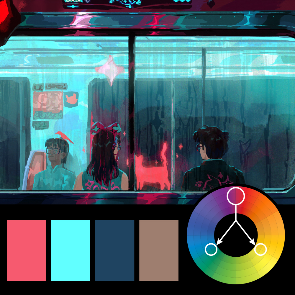
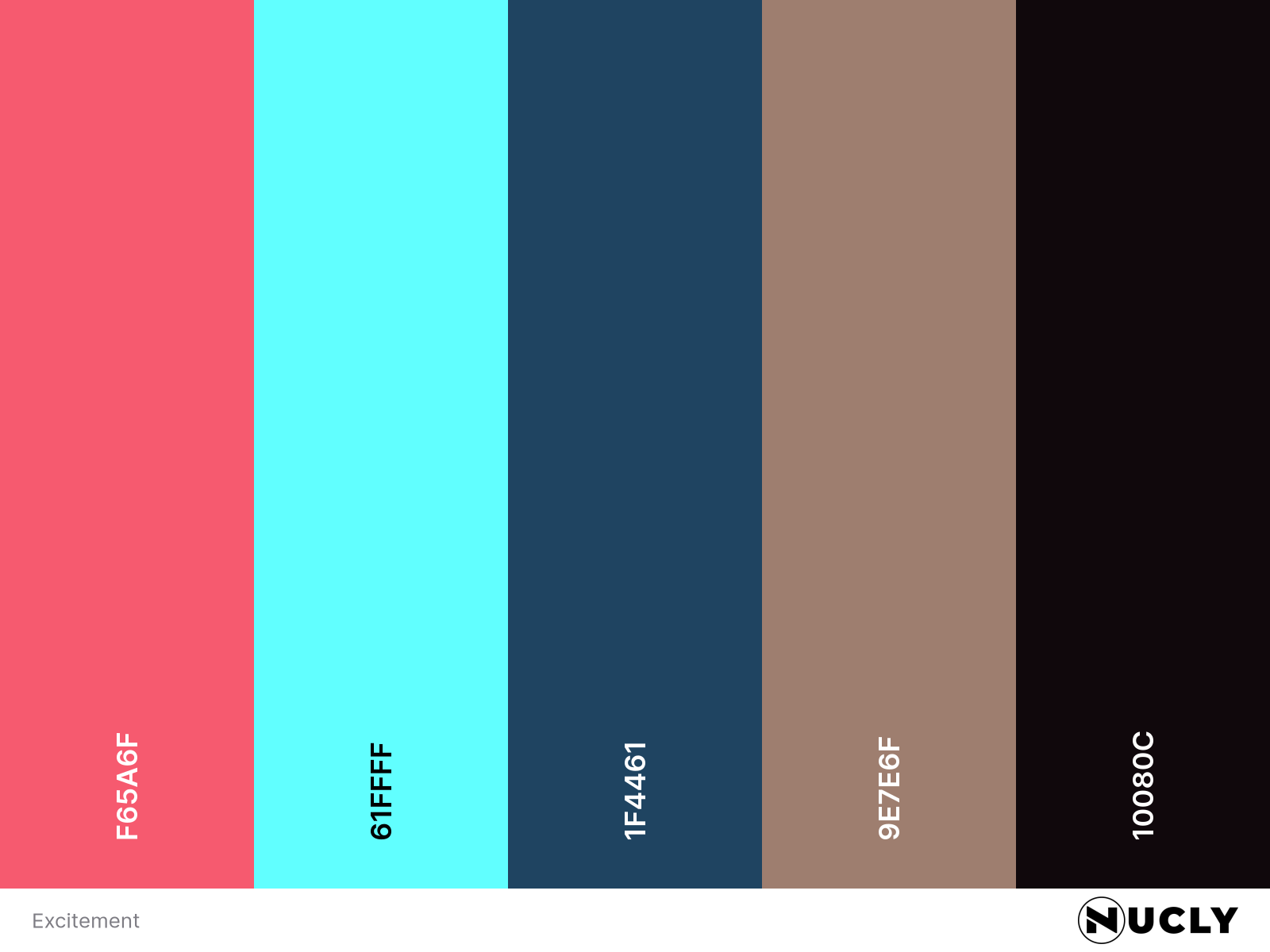
Artwork: Excitement — Thomas Fernandes on ArtStation
Color Harmony: Triadic
Key Color: Pink-Red
Link to Palette: Colors on coolors.co
Thomas Fernandes' Excitement uses a triadic palette built around a pink-red key color, supported by aqua-cyan and a heavily muted yellow. The pink-red accents do most of the visual work, drawing your eye to the glowing cat, reflections, and small design elements throughout the train car. The cyan dominates the environment, while the yellow stays subtle, appearing mostly in the skin tones and helping keep the palette balanced.
What makes the piece interesting is how much detail it appears to contain. Zoom in and the brushwork is loose and economical. Zoom out and suddenly there are dirty windows, rain streaks, reflections, glowing signage, fabric patterns, and tiny highlights on eyeglasses. Very little is explicitly rendered, yet the overall impression feels rich and complete. It's a great example of detail being suggested rather than painted.