Teal and Fire at the Gates
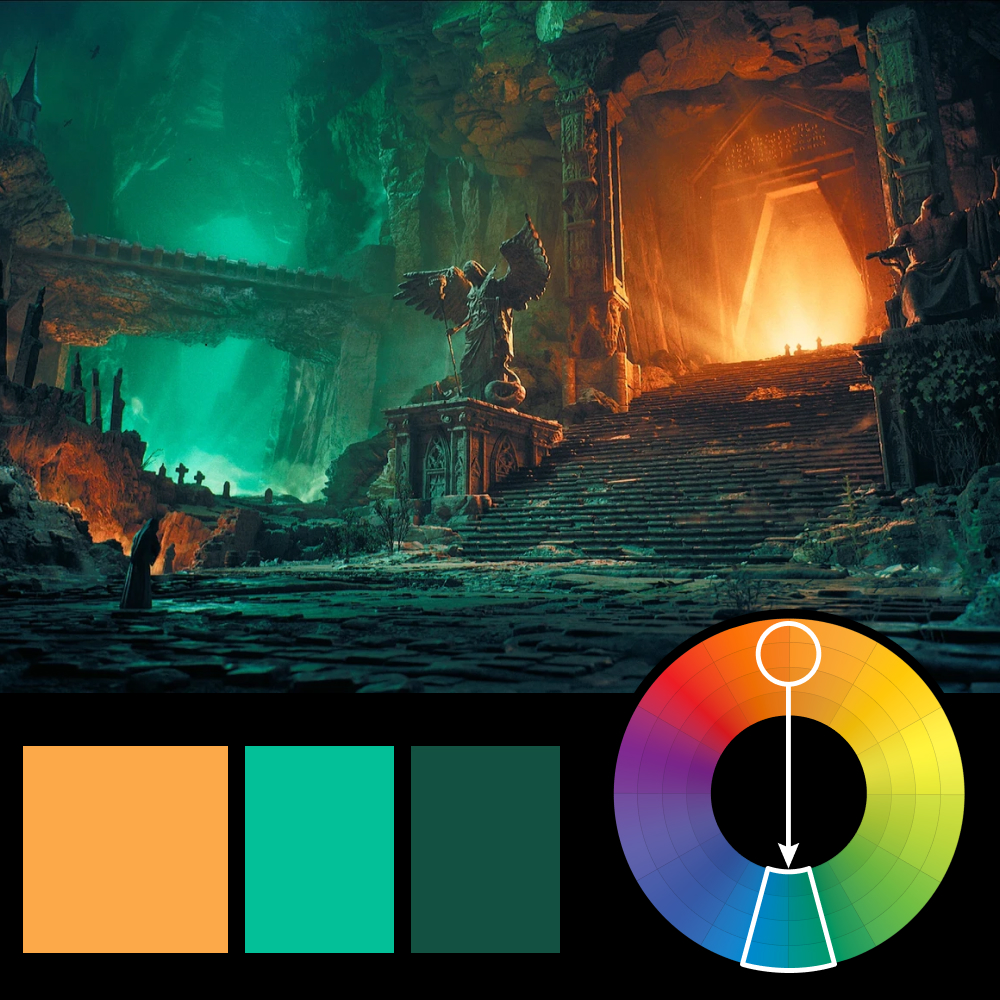
Artwork: Gates of the Underworld by Michel Mouradian (ArtStation)
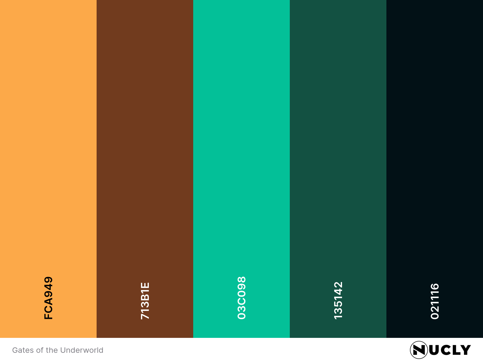
Color Harmony: Direct Complementary
Key Color: Orange
Link to Palette: Colors on coolors.co
This week's artwork is Gates of the Underworld by Michel Mouradian, and it’s a masterclass in using color contrast to create mood and scale. The dominant orange glow of the portal is rich and saturated, pulling your eye immediately—and because it's paired with teal, its direct complementary, the effect is electric.
That intense contrast is balanced by a large amount of cool hues, allowing the warmth to feel focused and intentional. This is a perfect example of how color harmony can serve both narrative and design: the orange tells us something powerful, something otherworldly is beyond the door, while the teal keeps the composition grounded in shadow and mystery.