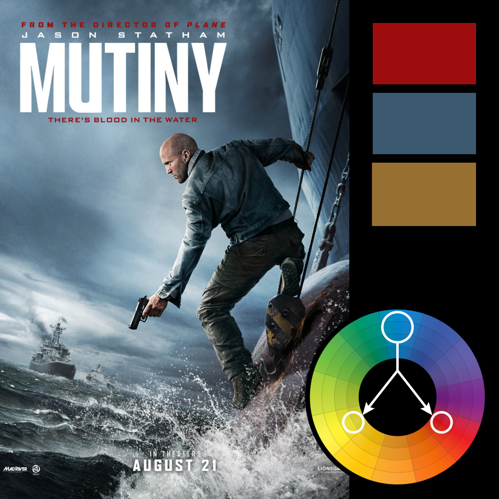
Storm Blue with Two Sharp Accents
Artwork: Mutiny Poster on impawards
Color Harmony: Triadic
Key Color: Blue
Link to Palette: Colors on coolors.co
The Mutiny poster is a textbook example of restrained triadic color harmony. Blue dominates nearly the entire frame—storm clouds, ocean, and wardrobe—pushing the palette into a cold, desaturated range. The other two triadic colors show up only as accents: the red in the title and the yellow paint on the hook Jason Statham is stepping off. Small touches, but they carry a lot of visual weight against that wall of blue.
Technically, the composite is strong. Lighting, scale, and motion all sell the scene. But the composition could have gone further. A foreground element would help frame the action, and the secondary story element—the burning ship—feels disconnected from the subject. Even a simple glance from Statham toward the ship would tie it together. And with the tagline “There’s blood in the water,” it’s hard not to wish they had actually put some blood in the water.