A Split Complementary with Commitment Issues
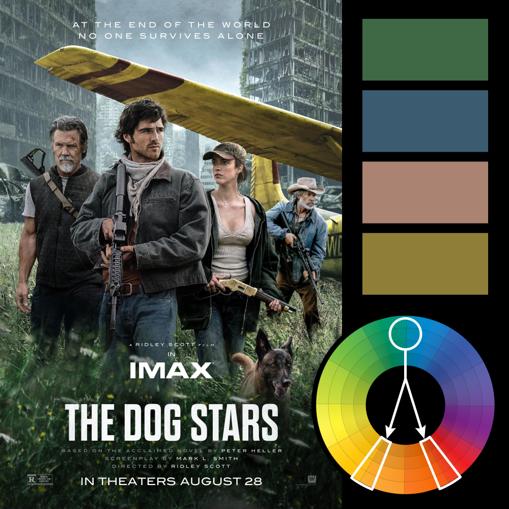
Artwork: The Dog Stars Poster
Color Harmony: Split Complementary
Key Color: Blue-Green / Blue
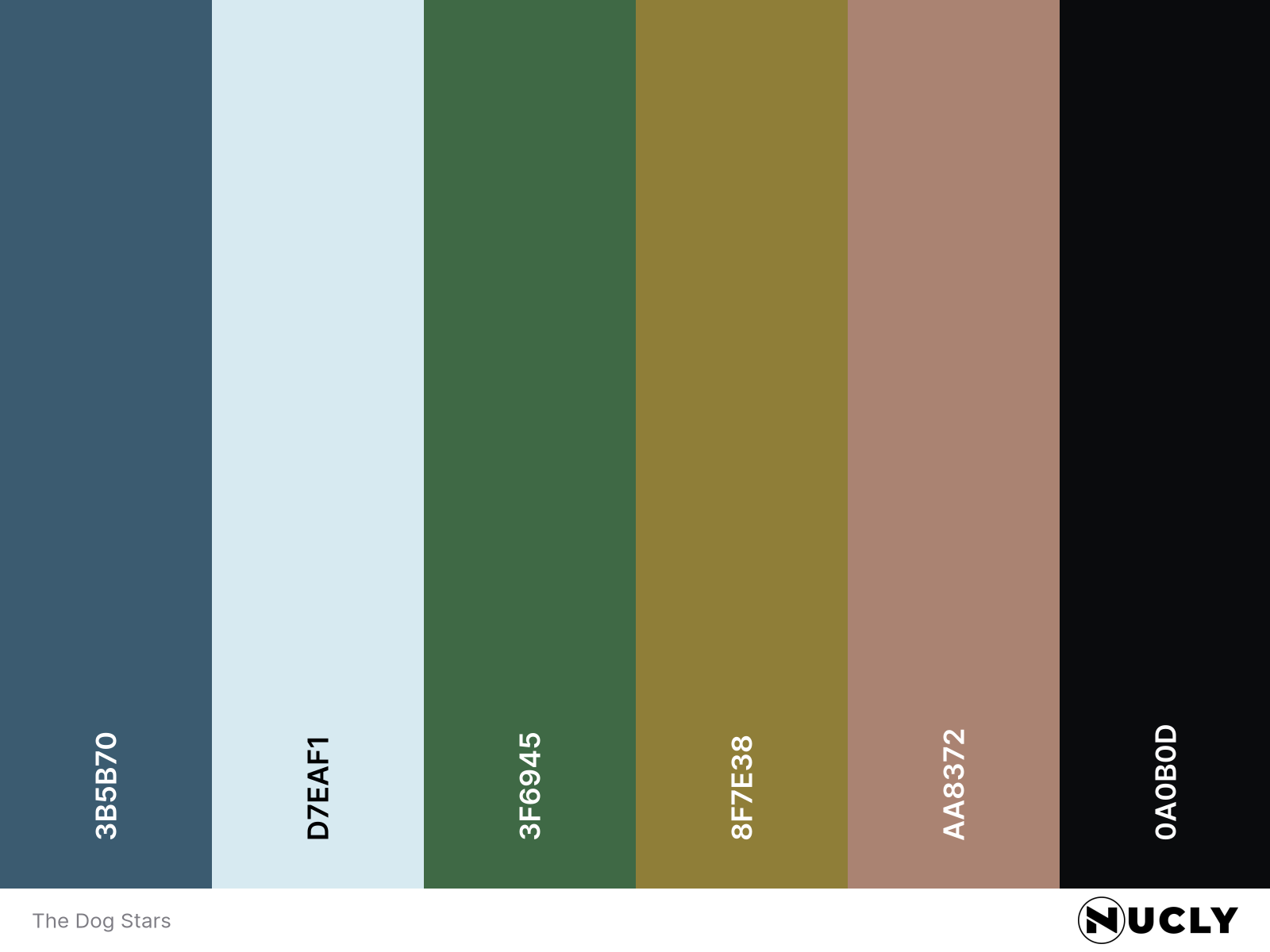
Link to Palette: Colors on coolors.co
The poster for The Dog Stars uses a split complementary harmony, although it does so a little differently than most. Instead of committing to a single cool key color, it divides that role between a blue-green in the foreground and an indigo blue in the sky. The warm side is much clearer, with the yellow airplane wing and the warm reds in the skin tones and wing stripes providing the contrast.
While the poster is a rather by-the-numbers cast poster, it makes its secondary star (the biplane) stand out with strong contrasting colors, separating it from the rest of the scene. It almost justifies the use of two key colors... although I still think they could have pulled it off with one.