When Color Grading Changes the Harmony
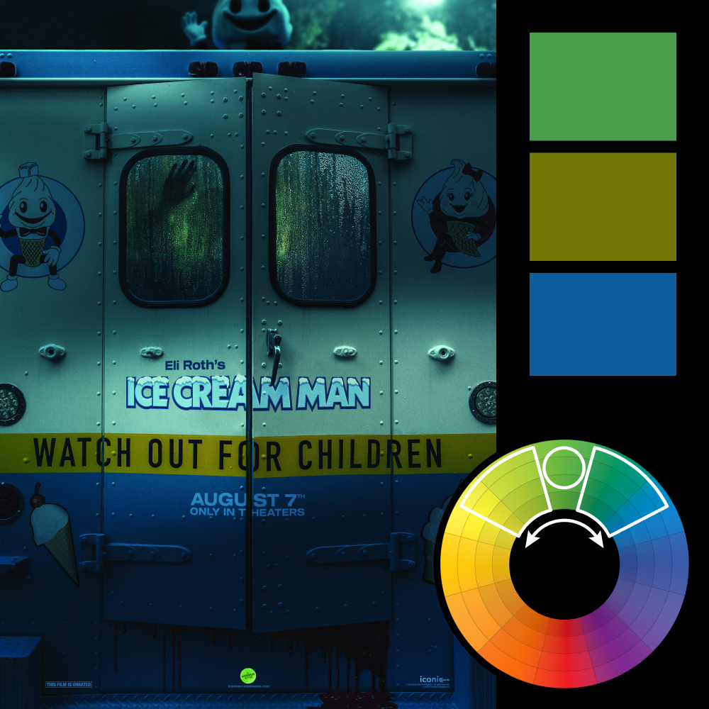
Artwork: Ice Cream Man Poster
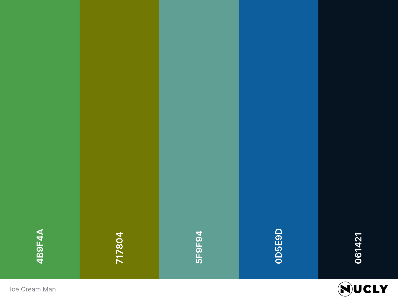
Color Harmony: Analogous
Key Color: Green
Link to Palette: Colors on coolors.co
At first glance, this poster looks like a simple blue and gold pairing. But the heavy color grade pushes both ends of the palette toward green. The yellow tape shifts toward chartreuse. The truck and shadows lean teal. What should be a complementary setup ends up sitting inside a tight analogous range instead.
That shift changes the mood completely. Instead of sharp color contrast, the image feels cold and unified. The real tension comes from the composition—the fogged windows, the hand pressed against the glass, the smiling mascot peeking over the roof. The color harmony keeps everything visually calm while the details quietly do the unsettling work.