Making Complementary Feel Sophisticated
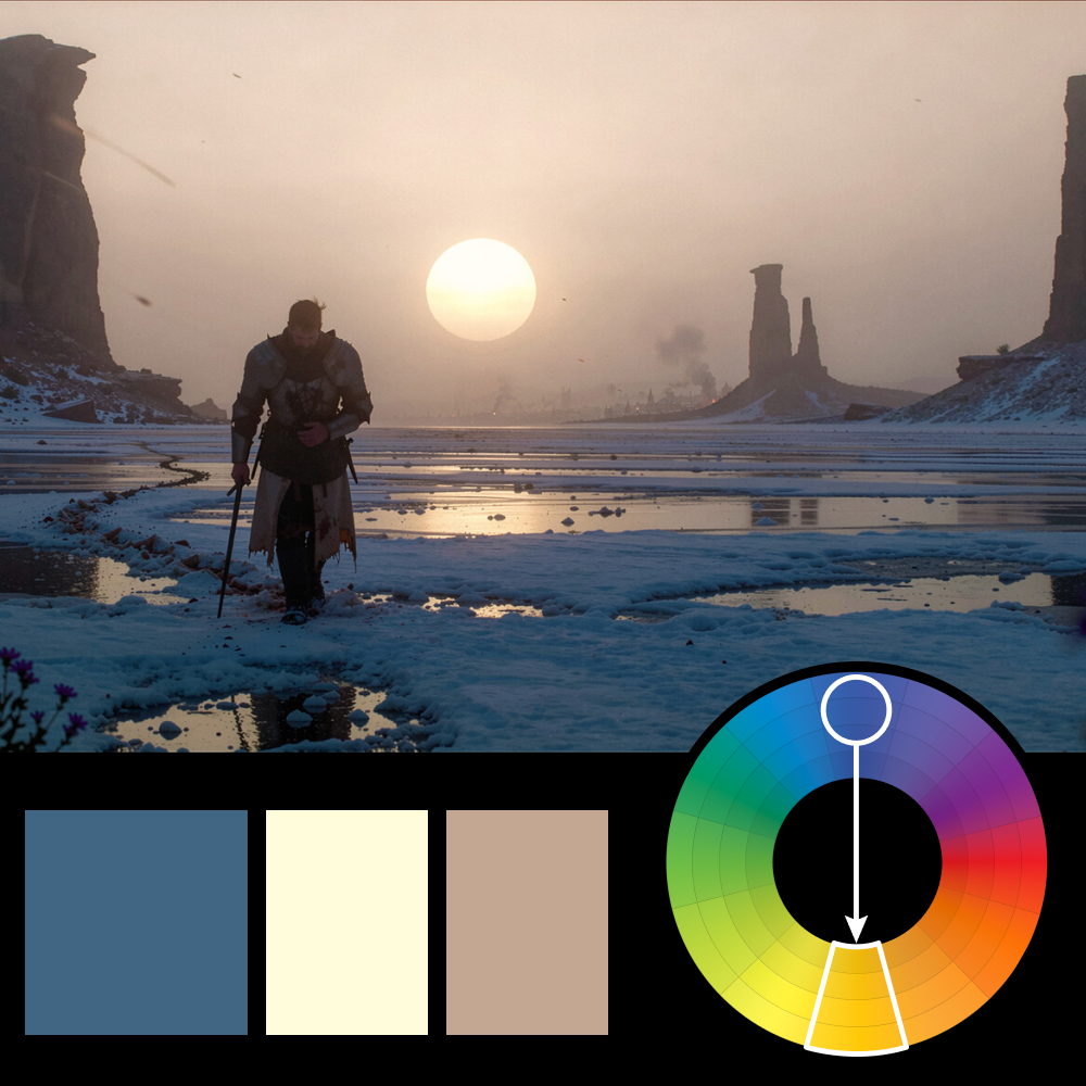
Artwork: Survivor by Jacek Pilarski (ArtStation)
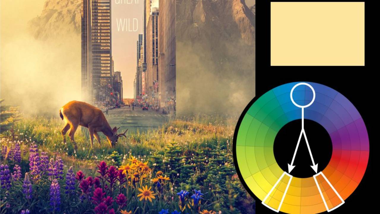
Color Harmony: Complementary
Key Color: Blue
Link to Palette: Colors on coolors.co
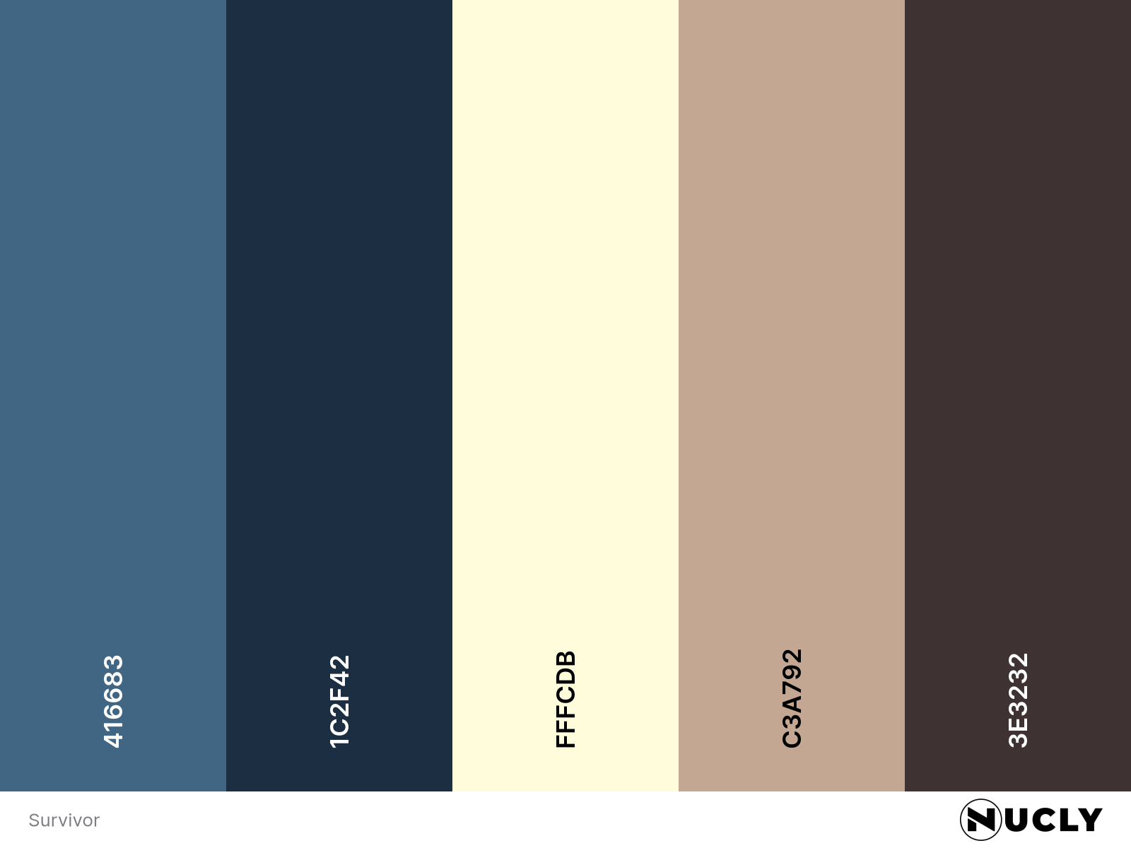
Complementary color harmonies can easily feel unsophisticated. There’s a reason you see them so often in comic book costumes and children’s content. Here, the familiar blue and yellow pairing is heavily desaturated, with the cold blue landscape balanced by the pale warmth of the sky and setting sun.
What elevates the image is the composition and storytelling. At first, it’s simply a lone survivor crossing a frozen landscape. Then you start finding the details—the flowers in the foreground, the distant city burning on the horizon. They’re tiny, but they change the story. The color gets your attention. The details make you stay.