Kung Fu Panda meets color theory

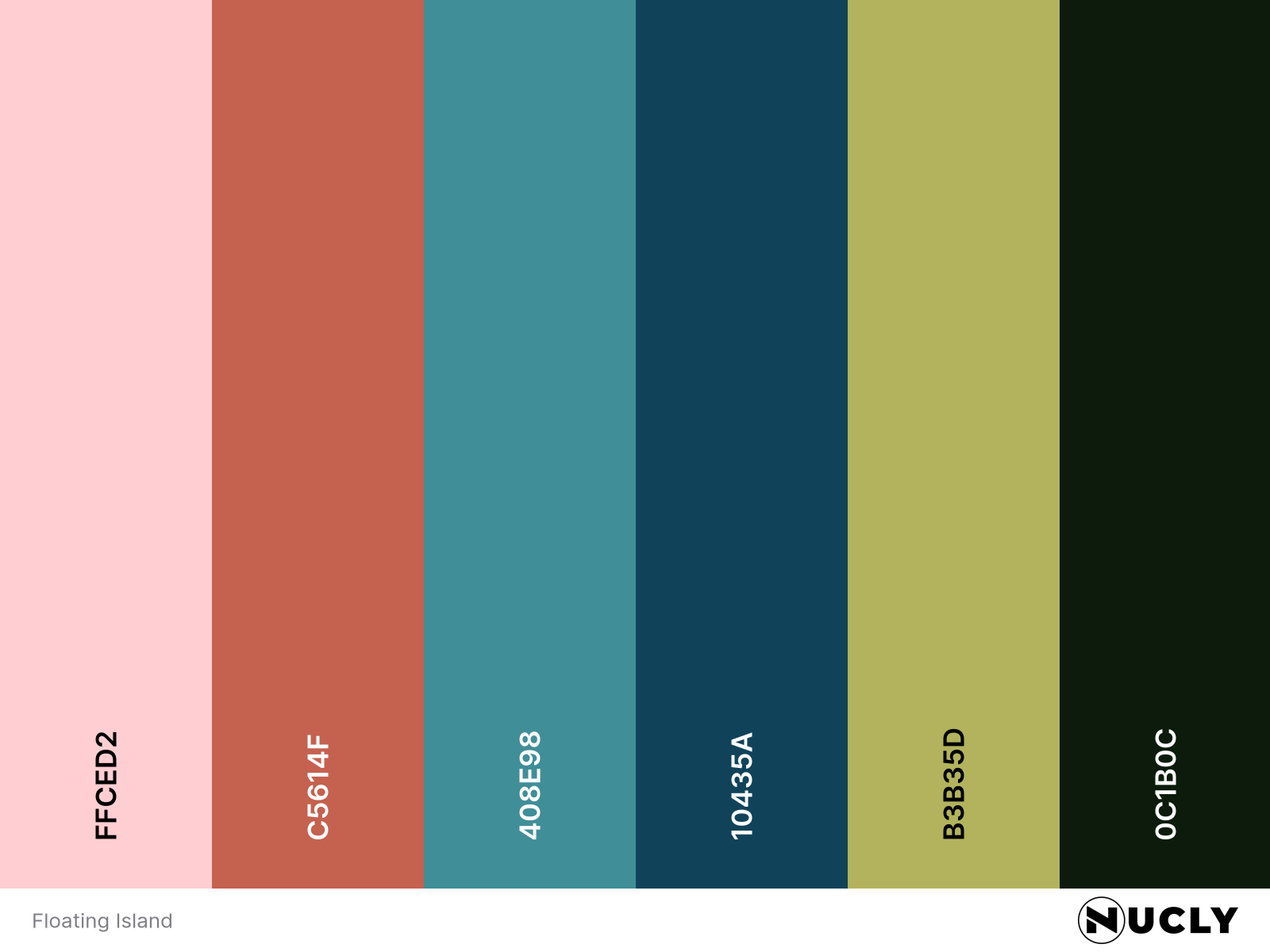
Artwork: Floating Island by Antonio Bravo
Color Harmony: Triadic
Key Color: Soft Pink
Link to Palette: Colors on coolors.co
This dreamy landscape floats somewhere between the worlds of Kung Fu Panda and Avatar. Using a triadic palette, it centers on soft pinks from the cherry blossoms, echoed as deep reds in the bridge and pagoda, balanced by a dusty teal and yellow-green.
What makes the image sing isn’t just the harmony itself—but how it’s staged. Strong foreground contrast, layered mist, and a consistent palette give the scene depth, cohesion, and storybook energy. It's a reminder that color harmony doesn’t need to shout—it can whisper and still work wonders.