Complementary colors with a radioactive twist
color analysis color harmony complementary concept art
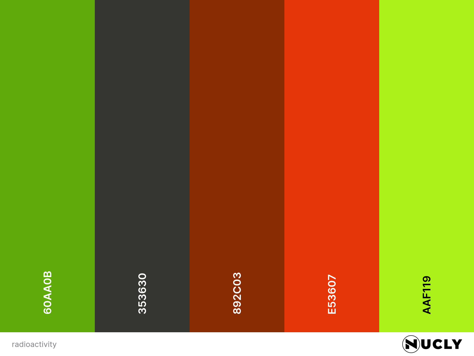
Artwork: Radioactivity by Victor Hugo Harmatiuk on ArtStation
Color Harmony: Complementary
Key Color: Green
Link to Palette: Colors on coolors.co
This piece proves you don’t need a wide palette to make an image feel vast. Nearly every pixel here sits in the green spectrum, with only the faintest accents of red to create contrast and tension. The choice of complementary harmony feels intentional and controlled, almost radioactive in its glow—punctuated by incredible texture and detail that make the environment feel enormous, despite its simplicity.
Are you subscribed to Nucly's YouTube channel?
It's the fastest way to find out about new tutorials.
Categories
All Categories 3d lettering actions adjustment brush adjustment presets ai analogous animal hybrid animation backdrops beginner blend if blending bloom effect blur book cover brushes camera raw cartoon chromatic abberation cloth color analysis color balance color depth color grading color harmony color match color range complementary complimentary composite compound harmony concept art content aware fill cropping curves custom brushes depth maps depth of feld designing with type difference blending mode disney dispersion effect distort effect drop shadow duotones dust and scratches dynamic text effects engraving eye droppers eyes fabric face swap film grain filters firefly focal depth frame tool frequency separation gear generate image generative fill getting started series gif glass filter glow box gradient gradients grunge guide layout halftone halloween hard mix harmonize tool hue saturation illustration illustrator kinds of kindness knockout lasso layer styles lighting effects lightsaber effect liquify luts mask masking move tool movie poster noise noise gradient oil paint optics overlays painting palettes pattern pattern fill pen tool photography photoshop 2023 photoshop 2024 photoshop tricks photoshop updates pop art puppet warp quick mask quick selection tool realistic snow remove glare from glasses restoration retouching rgb curve rikard rockwell rotation rule of thirds script selection brush selections shadows silhouette skin retouching smart objects split complementary split water effect spooky step and repeat tetriadic textures tips and tricks tools tree filter triadic color harmony tutorials typography user interface video tutorial vignette water droplet effect watercolor wicked youtube
Join the new ALL-ACCESS Nucly Photoshop Academy
With our brand-new Nucly Academy, you get access to all of my professional training, my full library of Photoshop addons, presets and tools. And, most important, you get access to our exclusive community that includes challenges, zoom meetups, chats, Q&As and more. Explore now!


