Blue leads the charge in this triadic collage
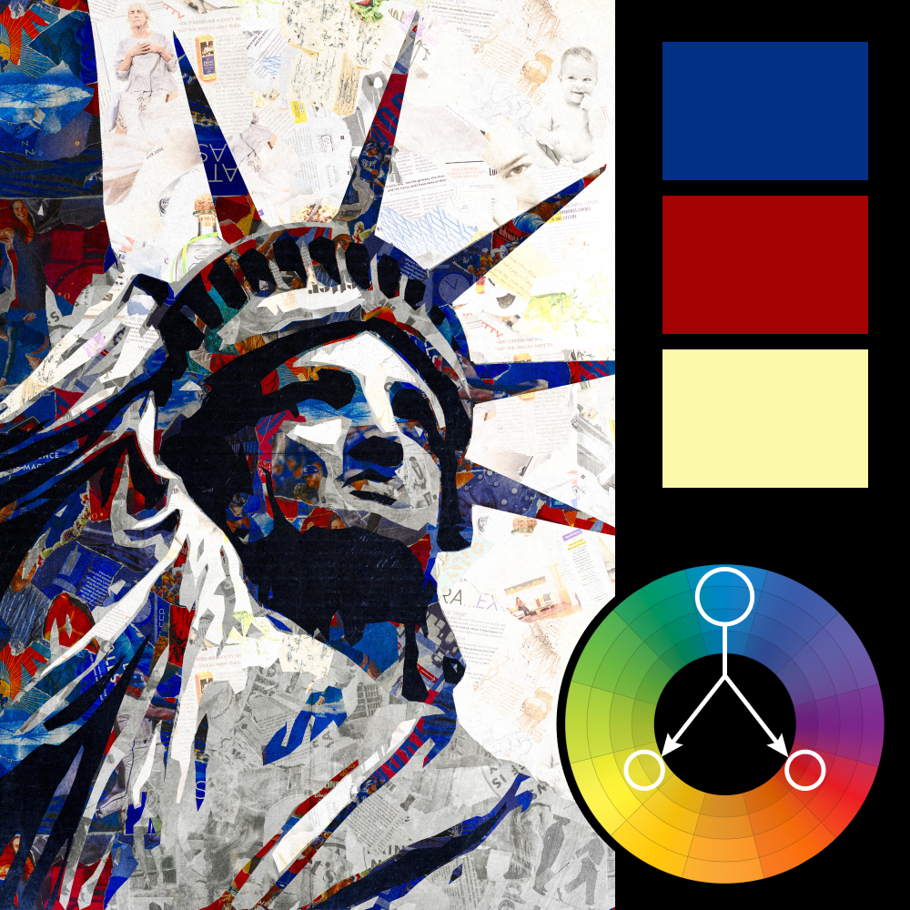
Artwork: An American Collage (from the upcoming Paper Collage Creative Project)
Color Harmony: Triadic
Key Color: Blue
Link to Palette: Colors on coolors.co
This week’s image, taken from our upcoming Paper Collage Creative Project, is a vibrant example of triadic color harmony done with bold intention. Blue leads the palette, balanced by saturated red and pale yellow—each used with a graphic, almost poster-like confidence.
Built from cut-up magazine clippings, the image doesn’t just use color for contrast—it uses it for commentary. The interplay of primary hues against a chaotic collage of paper textures gives this piece both clarity and grit, like a manifesto layered onto a wall of noise.


