Autumn Reflections in Split Harmony
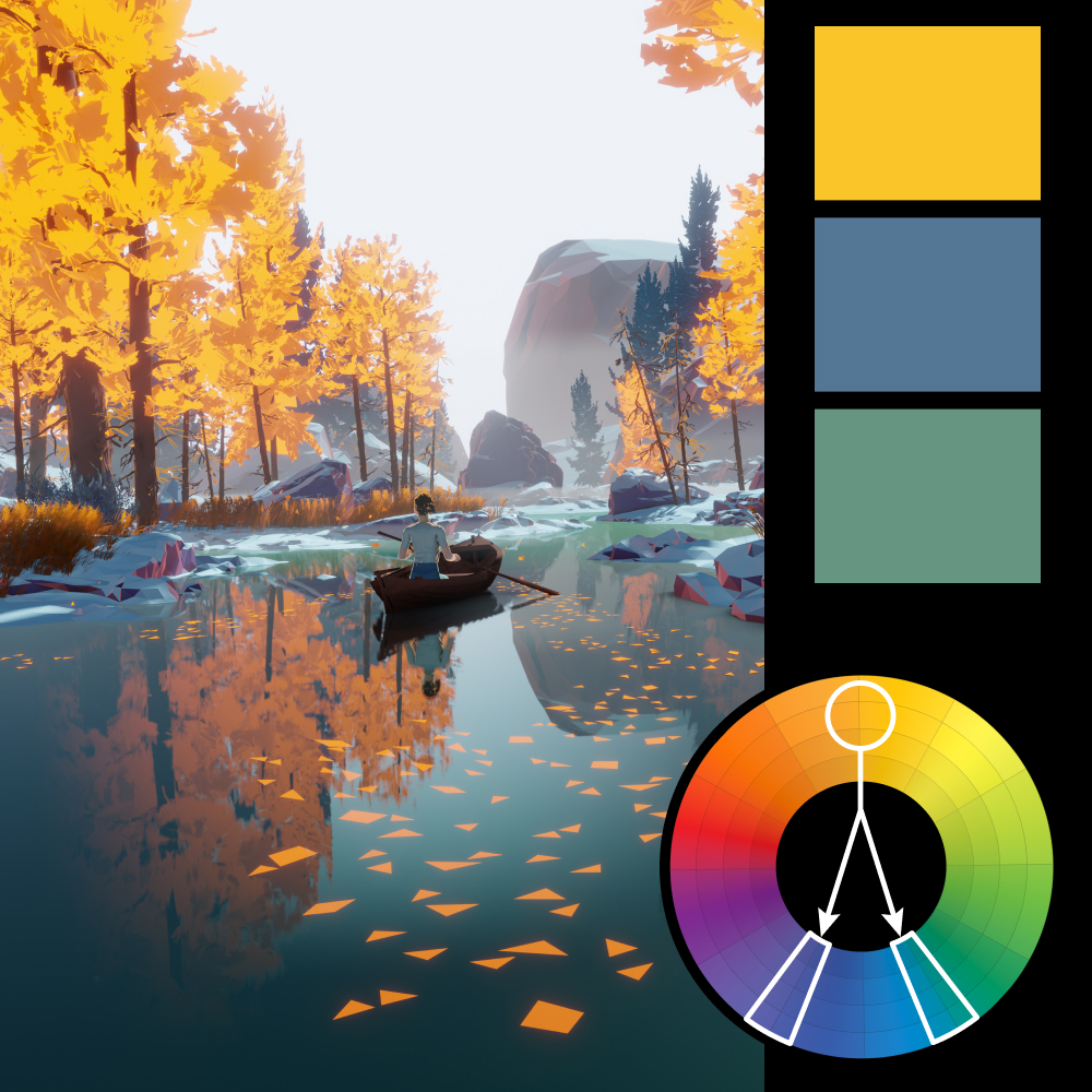
Artwork: Environment Study by Robin Tran
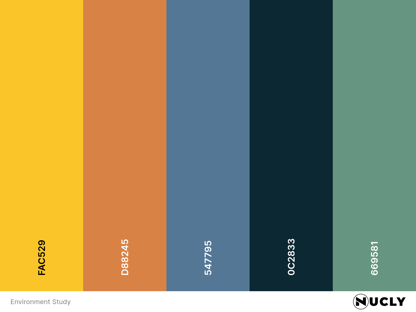
Color Harmony: Split Complementary
Key Color: Warm Yellow
Link to Palette: Colors on coolors.co
This week’s artwork is a stylized autumn scene—an idyllic river, golden trees, and a solitary rowboat captured in a moment of calm reflection. It’s a perfect fit for the season, and a reminder of how color can evoke both stillness and warmth in a single frame.
The key color is a vibrant golden yellow, complemented by muted green-blue and dusty purple-blue tones. The split complementary palette helps the scene feel rich and layered without tipping into the garish contrast that sometimes comes with a strict complement. It’s a masterclass in balance—saturated without being overwhelming, vivid but serene.