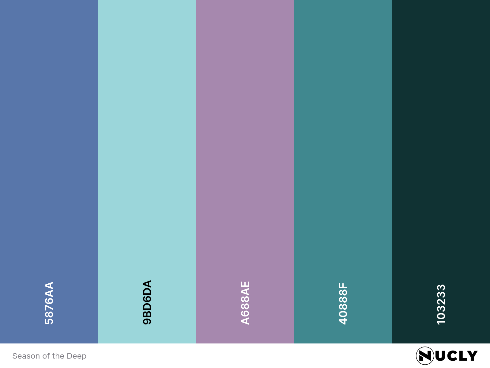
Analogous harmony from the deep

Artwork: Season of the Deep by Sung Choi from ArtStation
Color Harmony: Analogous
Key Color: Blue
Link to Palette: colors on coolors.co
This deep-sea concept piece showcases an elegant use of analogous harmony—blue, violet, and cyan—spanning the cooler side of the color wheel. The palette creates a moody, submerged feeling that’s both surreal and serene, appropriate for a sci-fi narrative about isolation and mystery.
What’s most surprising here is the restraint: the key color, blue, appears the least. It's mostly tucked into the shadows and the astronaut’s suit, yet its presence holds the entire palette together. The more prominent lavenders and teals create flow and movement, while blue anchors the tone—quietly, but critically.