A Two-Color Palette
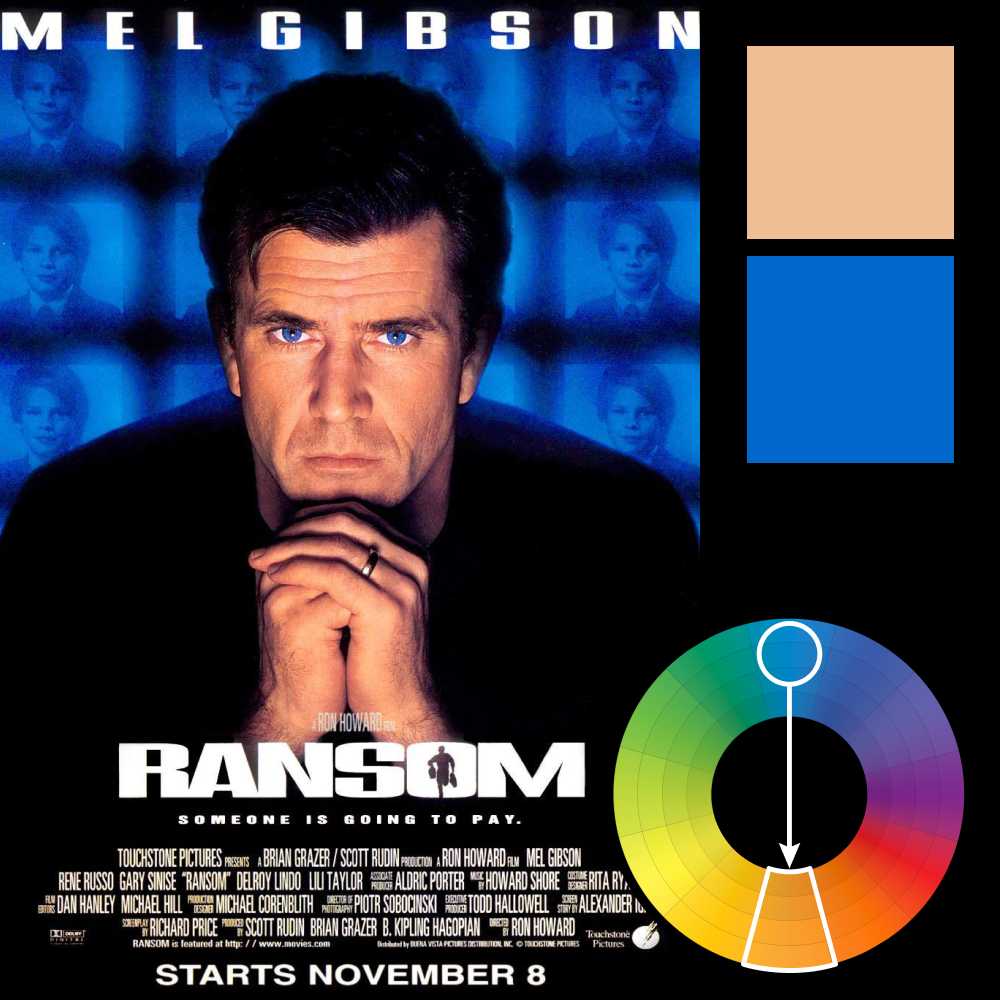
Artwork: Ransom
Color Harmony: Complementary
Key Color: Blue
Link to palette: Colors on coolors.co
This poster showcases a textbook use of complementary color harmony, with blue as the dominant hue and a warm peach tone as its counterpart. By matching the deep blues of the background with Mel Gibson’s eyes, the design unifies the composition and amplifies intensity. The peach tones of the skin are left untouched, serving as the only warmth in the poster—creating instant focus and contrast. It’s a controlled and deliberate palette, engineered to sharpen emotion and command attention.