A Sea of Blue and One Red Sail
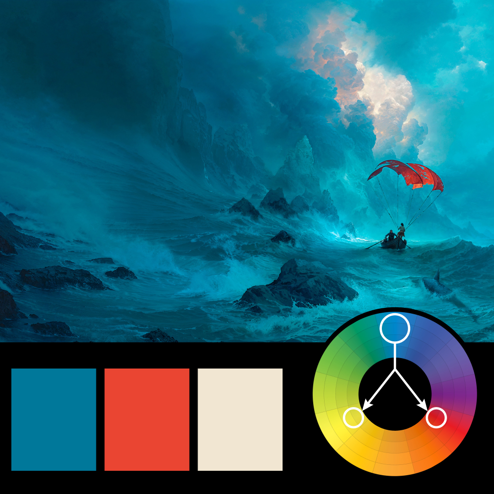
Artwork: ZE Book Cover Art — Guillem H. Pongiluppi
Color Harmony: Triadic
Key Color: Blue
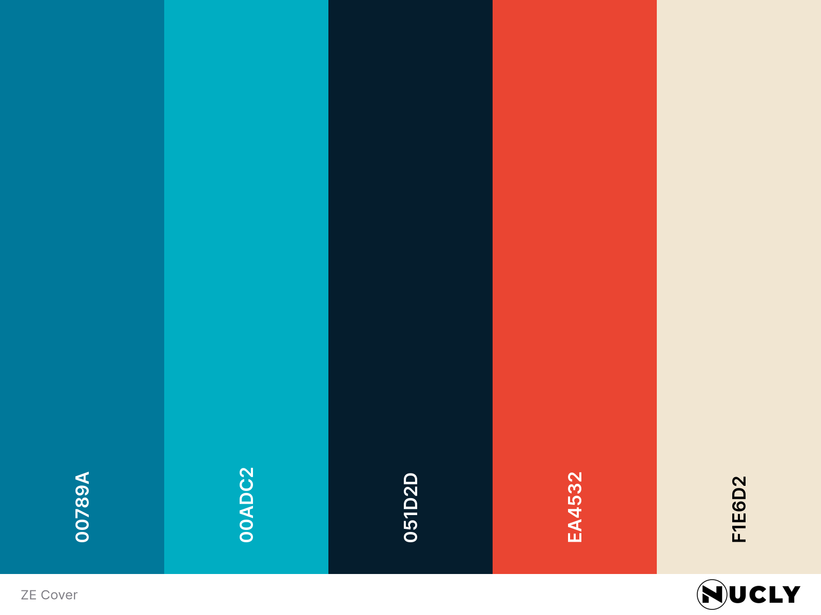
Link to Palette: Colors on coolors.co
Guillem H. Pongiluppi’s cover art for ZE uses a classic triadic harmony, but with a clear hierarchy. Blue dominates nearly the entire image, from the ocean to the sky to the distant cliffs. The red sail becomes the focal point simply because it’s the only significant interruption to that sea of blue, while the pale cream highlights in the clouds and surf complete the harmony without demanding attention.
What really sells the image is scale. The tiny boat feels impossibly small against the towering waves and clouds, and the red sail gives the eye an anchor in an otherwise overwhelming landscape. It’s a good reminder that color harmony isn’t always about balance. Sometimes one color does 90% of the work while the others exist simply to guide your attention.