A Paradise Painted in Three Tones
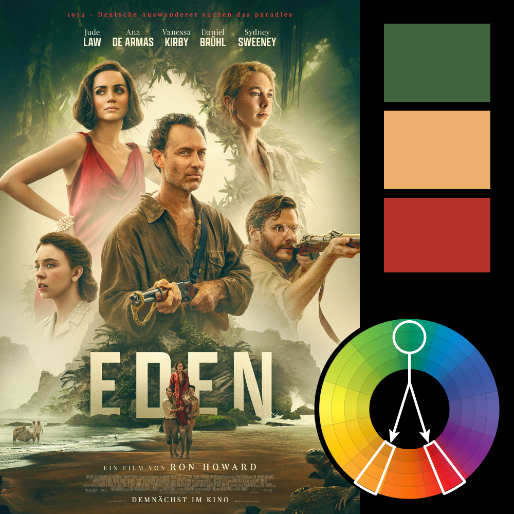
Artwork: Eden Movie Poster by Fable Agency
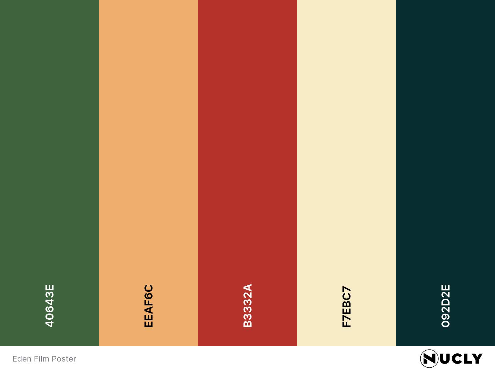
Color Harmony: Split Complementary
Key Color: Green
Link to Palette: Colors on coolors.co
The poster for Ron Howard’s upcoming Eden is a masterclass in visual restraint. The color scheme is stripped to a split complementary harmony with green as the anchor, and subtle accents of orange-peach and red.
Nearly every other hue has been dialed back or pushed toward this triad. The background melts into muted green and beige, while the red—used sparingly in just two characters—commands attention without overwhelming the scene. This deliberate limitation not only elevates the palette’s sophistication, but also sets an emotional tone that feels calm on the surface, yet uneasy underneath. Just like paradise should.