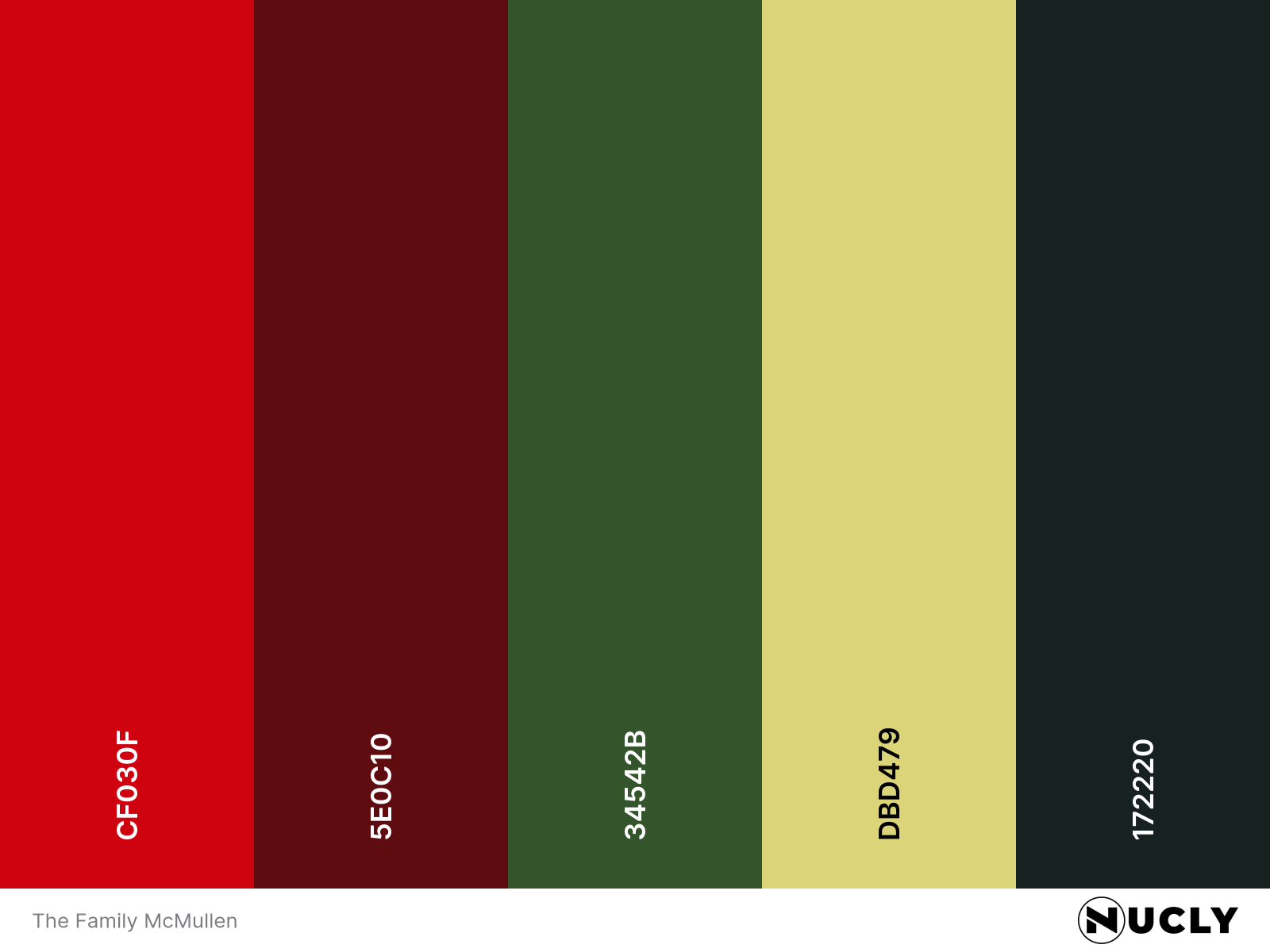
A family-sized complementary palette

Artwork: The Family McMullen – Movie Poster
Color Harmony: Complementary
Key Color: Red
Link to Palette: Colors on coolors.co
A playful twist on the classic red and green pairing, this poster embraces the complementary harmony in all its cozy, holiday-leaning glory. But instead of going bold and obvious, it mixes up the tones—deep burgundy, rich forest green, bright cherry, and chartreuse—creating variation that still feels unified.
With a dozen characters at the table, visual chaos could have taken over. But the harmony in wardrobe and lighting holds everything together. It may not be realistic for everyone at a family dinner to be so perfectly color-coordinated, but it makes for a poster that feels warm, intentional, and inviting.