When warm meets cold in orbit

Artwork: The Astronaut movie poster
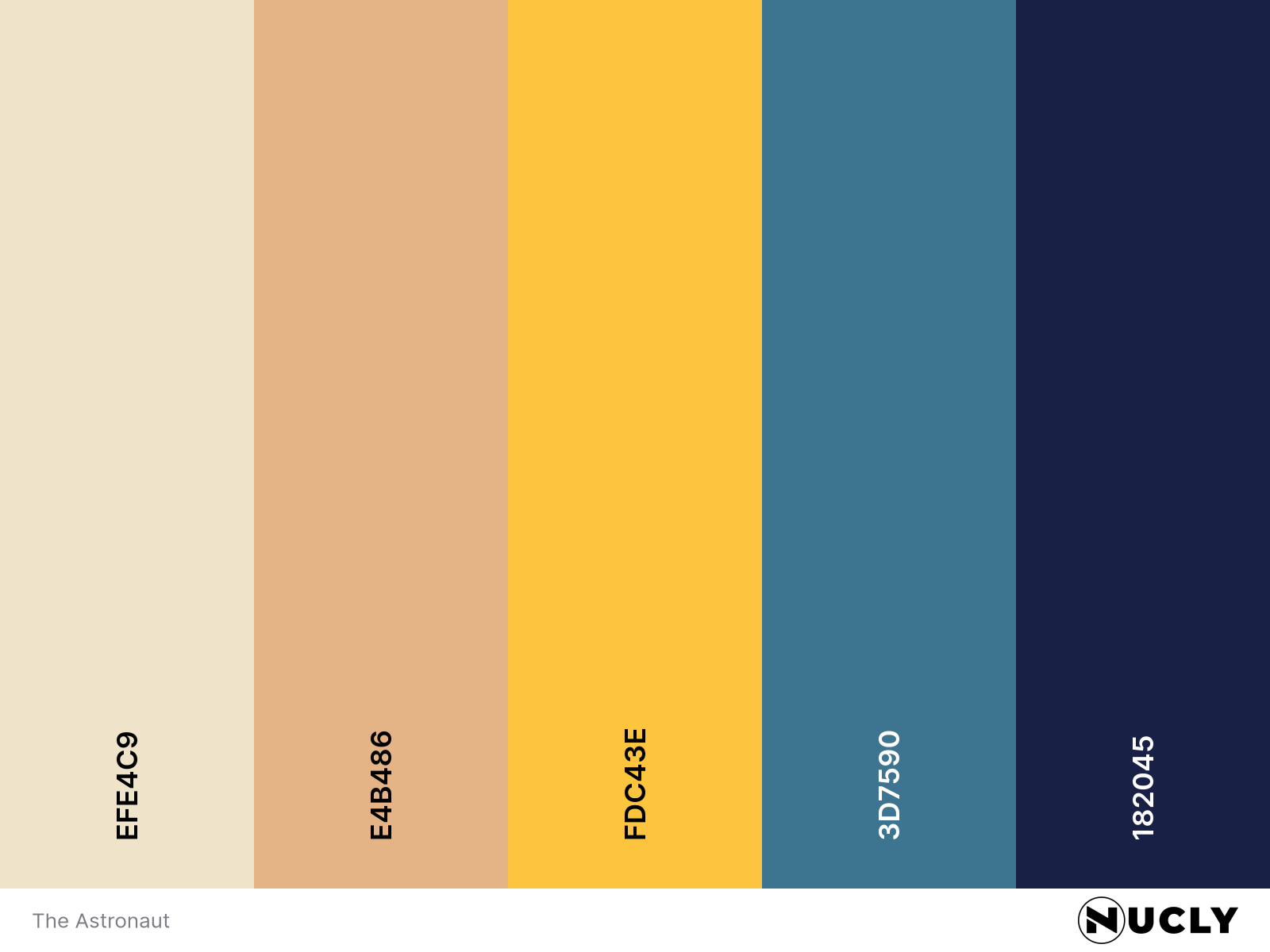
Color Harmony: Complementary
Key Color: Golden Beige
Link to Palette: Colors on coolors.co
This week's artwork is the poster for The Astronaut, which uses a classic complementary color harmony: warm, desaturated yellow-gold tones against deep, cool blues. It’s a palette that’s been used time and again in sci-fi and thrillers—but here, it’s done with clarity and restraint. Despite the high contrast, the colors are kept narrow in range, leaning more on mood than spectacle.
The real hook is the face: not terrified, not serene—just deeply unsettled. Like the Mona Lisa, it’s the ambiguity that makes you stare longer. It’s a poster that doesn’t just ask “What happens next?” but “What just happened?”