The Power of a Tight Crop
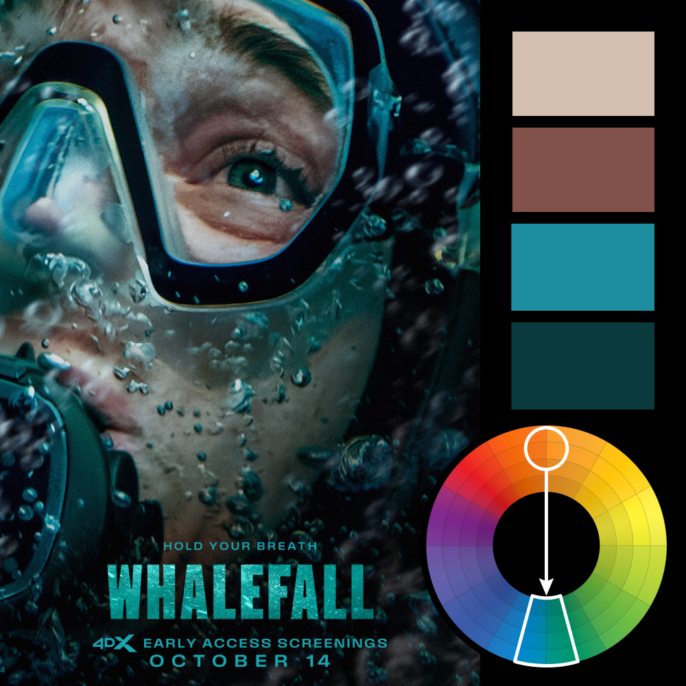
Artwork: Whalefall Poster on Impawards.com
Color Harmony: Complementary
Key Color: Aqua Blue
Link to Palette: Colors on coolors.co
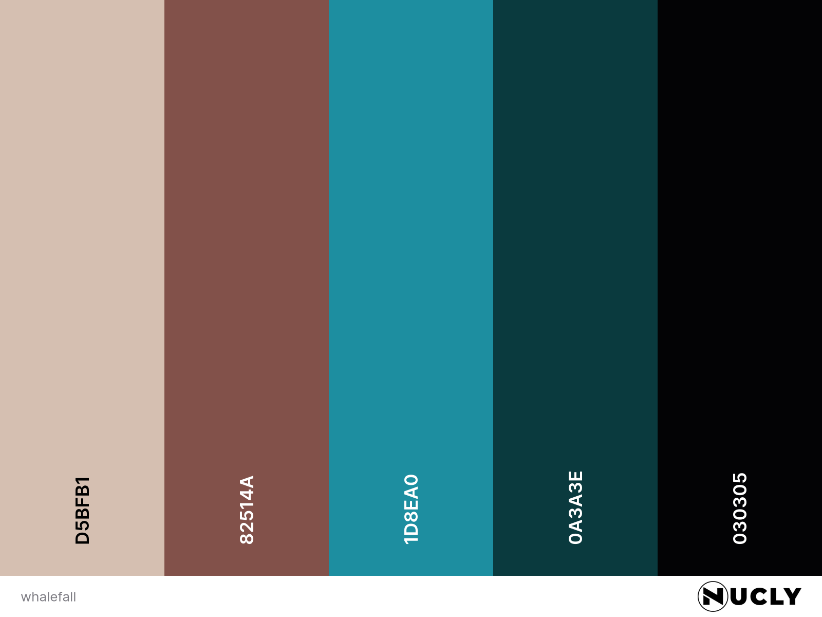
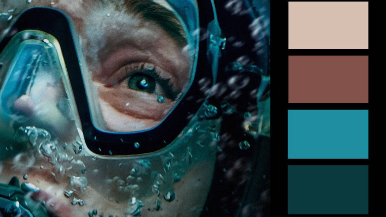
The poster for Whalefall uses a simple complementary harmony, pairing the aqua blue of the water with the heavily desaturated orange of the skin tones. Neither side needs to be particularly vivid—the temperature contrast is enough to separate the face from the surrounding water.
The design itself is just as simple. An extreme crop, a mask, bubbles, and one very expressive eye tell you almost everything you need to know. The tight framing makes the image feel claustrophobic, while the eye does most of the storytelling—fitting for a movie about a protagonist who finds himself in the rather tight spot of being swallowed by a whale.