The Colors Meet in the Middle
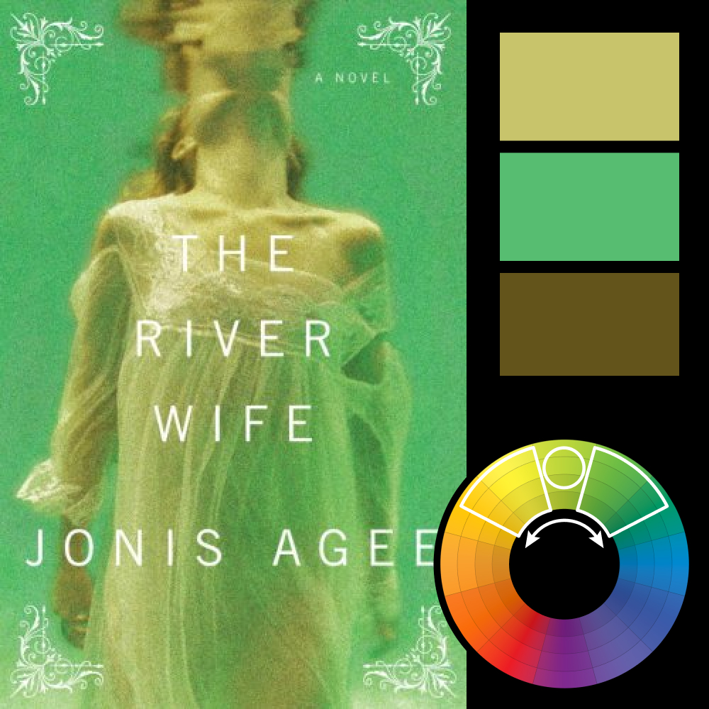
Artwork: The River Wife by Jonis Agee
Color Harmony: Analogous
Key Color: Yellow-Green
Link to Palette: Colors on coolors.co
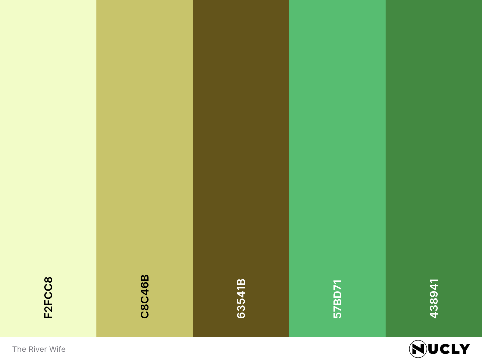
At first glance, this cover almost feels complementary, with warm orange-browns against a cool teal background. But the strong yellow-green grade pulls everything toward the middle, turning it into an analogous harmony. It's also a good reminder that analogous doesn't have to mean all warm or all cool. Crossing that warm/cool line, even slightly, can give the palette much more depth.
The design itself leaves a lot unanswered. We see a woman, but barely. Her face is obscured, the image is soft, and even the period and setting aren't immediately clear. Instead of giving us information, the cover gives us just enough to start filling in the blanks ourselves. And that's often a much better way to create intrigue.