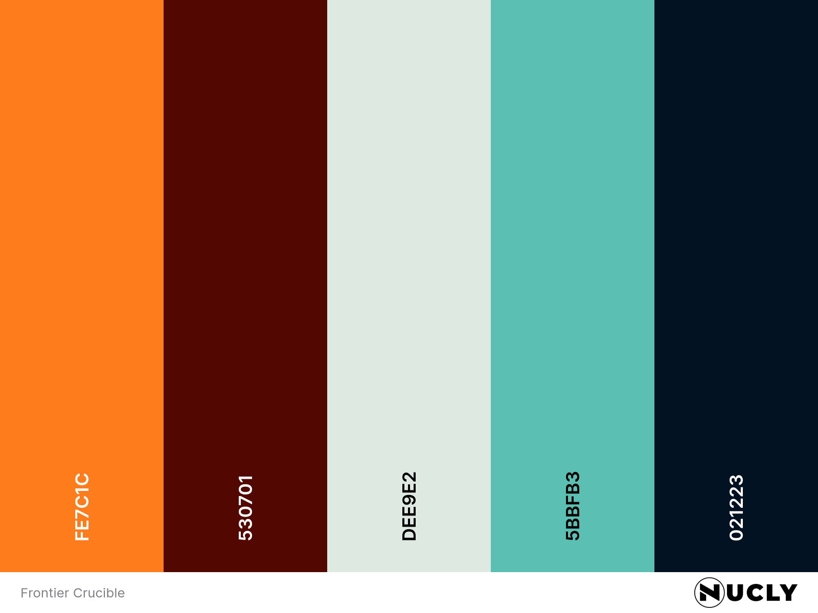
Teal & Orange with a Loaded Six-Shooter
Artwork: Poster for Frontier Crucible by the Boland Design Co
Color Harmony: Direct Complementary
Key Color: Teal
Link to Palette: Colors on coolors.co
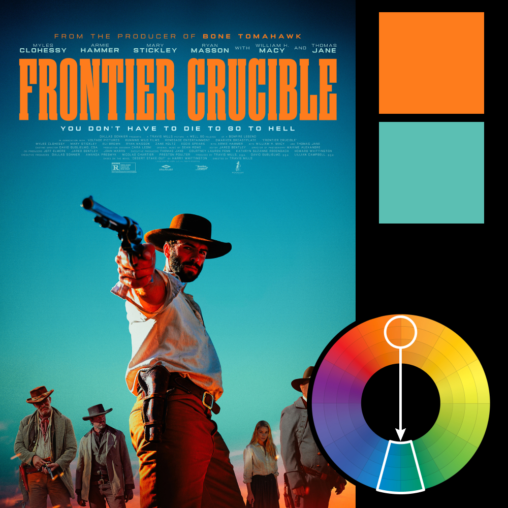
This week’s poster is Frontier Crucible—a poster I briefly mistook for a Red Dead Redemption video game poster. With its heavily stylized aesthetic and towering saturation levels, it looks like a relic of early 2000s Hollywood color grading, straight out of The Island or Transformers. It’s a full-tilt embrace of the now-infamous teal and orange combo—and it doesn’t flinch.
There’s nothing nuanced here. The color scheme is deliberately loud, making the poster feel less like a movie ad and more like a genre warning: gritty, bloody, and maybe a little unhinged. Whether it’s your taste or not, there’s no denying it grabs your attention.