Pink to blue and everything in between

Artwork: Character poster for Wicked: For Good
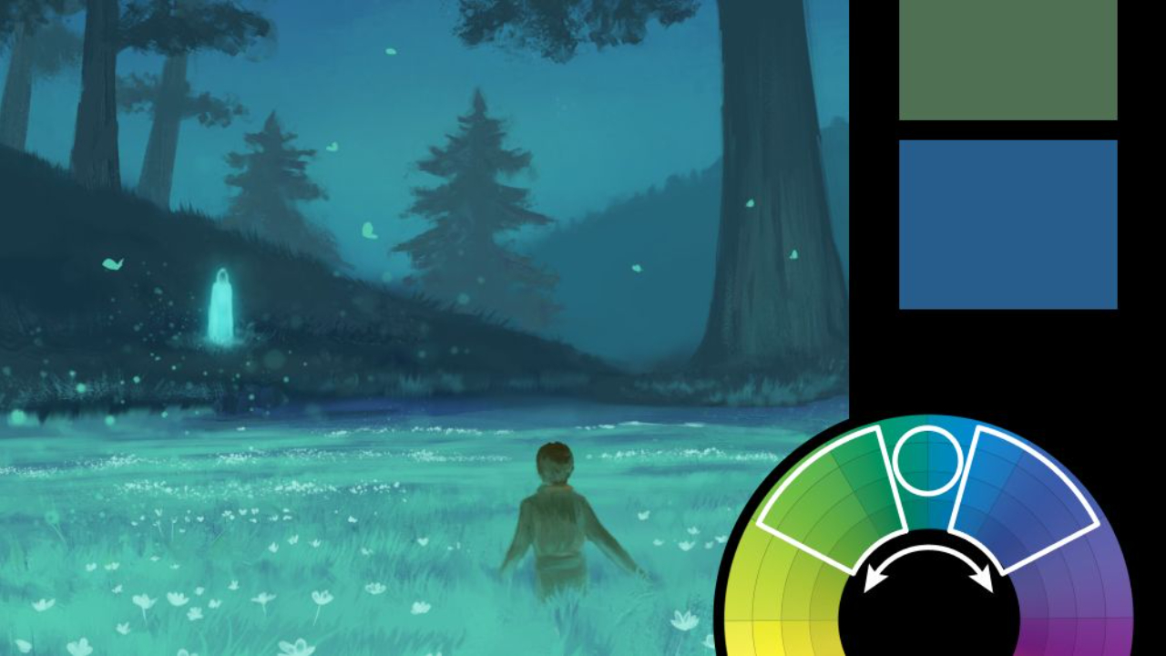
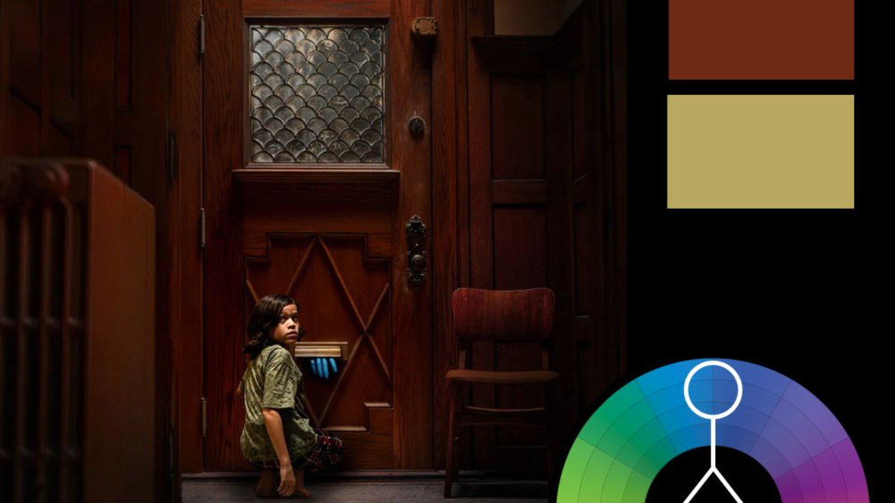
Color Harmony: Analogous
Key Color: Lavender
Link to Palette: Colors on coolors.co
This week, we're revisiting Wicked—this time, for good—with a radiant analogous palette that floats between pink, lavender, and blue. The soft transitions between hues give the poster a dreamy, whimsical quality that matches the character’s fairytale flair.
There were several character posters released for Wicked: For Good, each themed around a dominant color. But thanks to the use of analogous harmony, these single-hue palettes don’t feel flat or monochrome—instead, each feels rich and expressive, with enough color variation to remain dimensional while staying loyal to the central tone. It’s a great example of how a tightly controlled color harmony can still deliver depth, glamour, and visual impact.