Old-school horror harmony
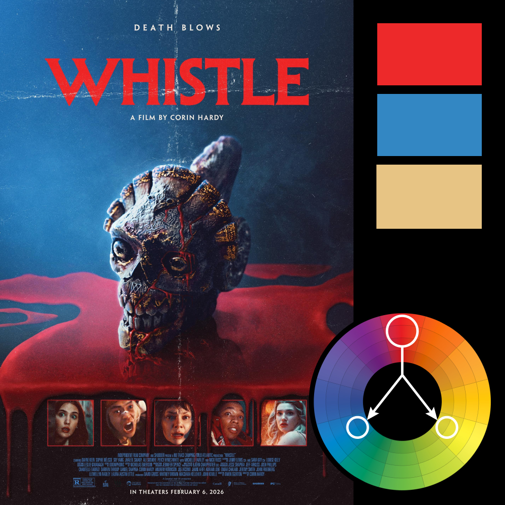
Artwork: Whistle – Movie Poster
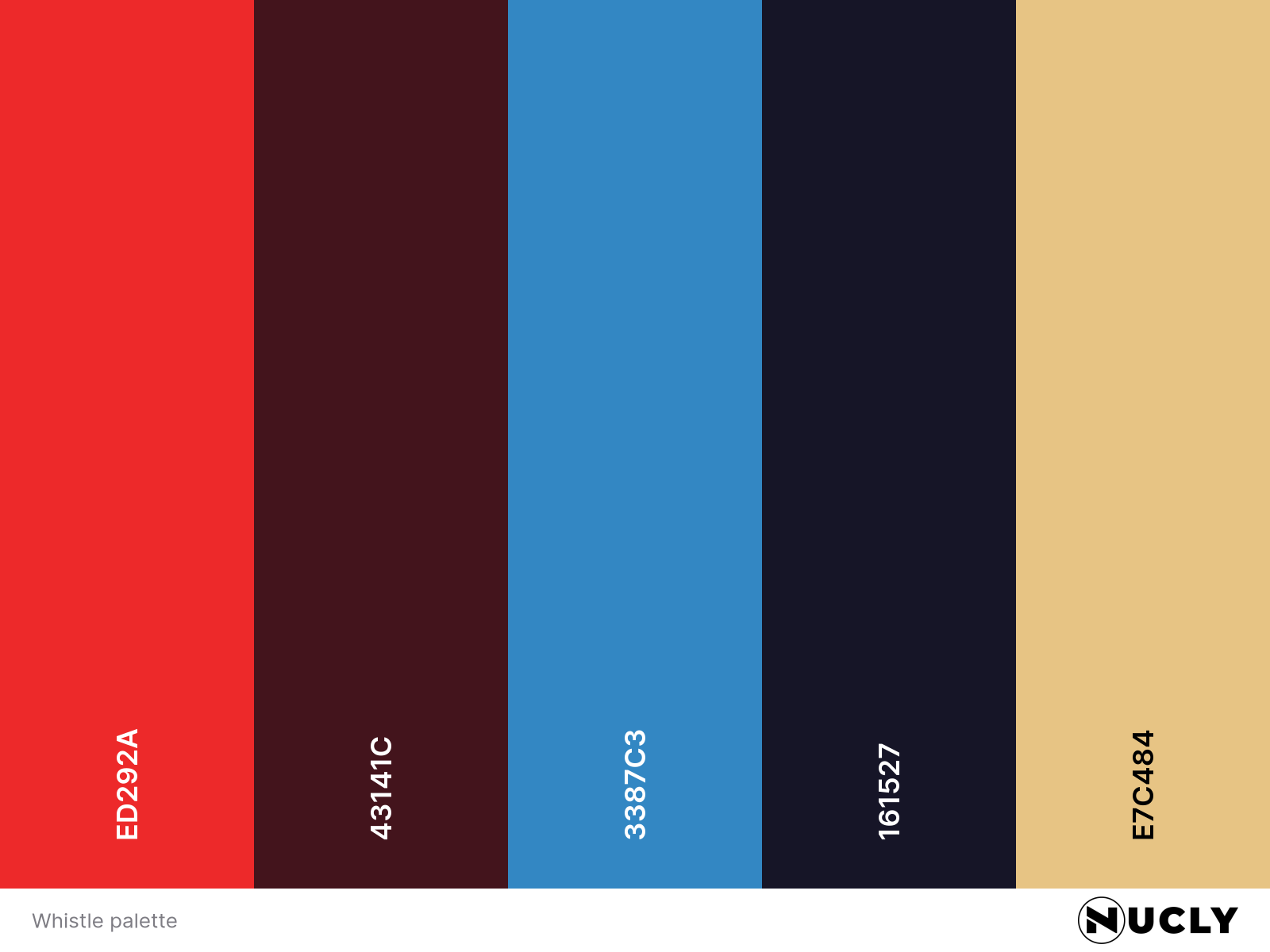
Color Harmony: Triadic
Key Color: Red
Link to Palette: Colors on coolors.co
The Whistle poster leans into the most iconic triadic combo: red, blue, and yellow. It’s a palette you’ll find in everything from Superman to cereal boxes—but here, it’s all horror. Red takes the lead, flooding the entire bottom half of the image in blood-like wax. Blue fills the atmosphere with an eerie chill, while yellow—always the quietest member of the triad—shows up as aged gold in the skull’s detailing.
The design is intentionally retro, with visible paper folds and distressed edges giving the entire poster a VHS-era patina. The layout is simple, the title is loud, and the image is unforgettable. It’s a visual throwback that shows how powerful color harmony can be when it’s used with restraint and purpose.