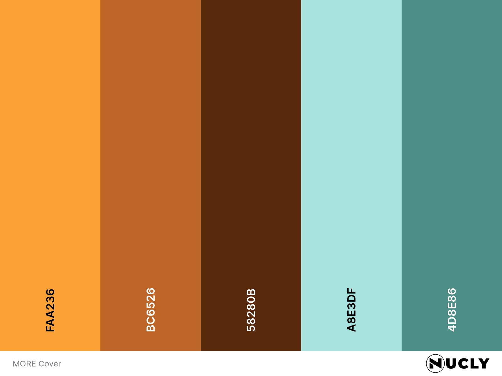
Minimal palette, maximum impact
Artwork: MORE Mag by Moli Studio
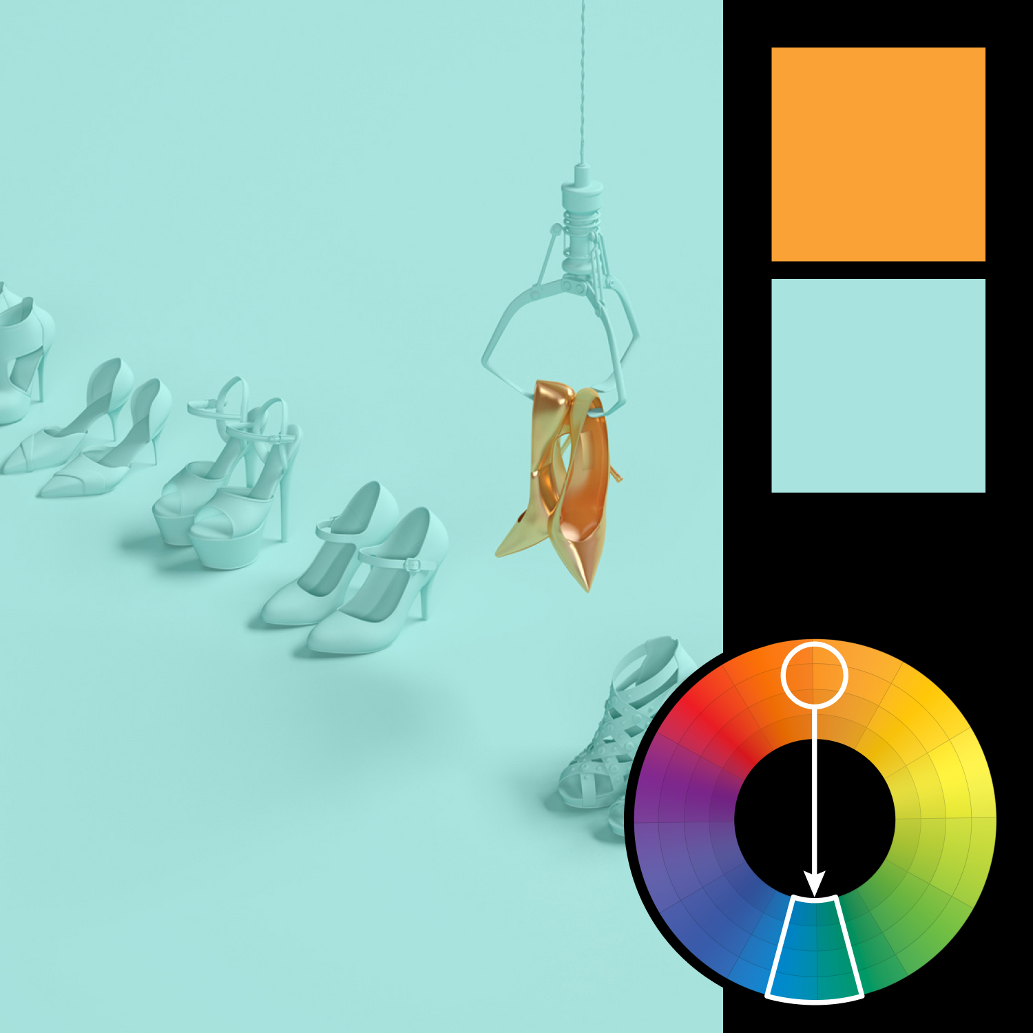
Color Harmony: Complementary
Key Color: Cyan
Link to Palette: Colors on coolors.co
This week’s image comes from Moli Studio and is a masterclass in visual restraint. Using a pure complementary harmony, the design pits a soft cyan against a rich orange—and then removes everything else. What’s left is a striking, minimalist composition that guides your eye exactly where it needs to go.
There’s also a brilliant use of negative space here. With only two hues, the image relies on scale, contrast, and spacing to communicate hierarchy and focus. In a world full of noise, this is proof that two colors—and one strong idea—can be more than enough.