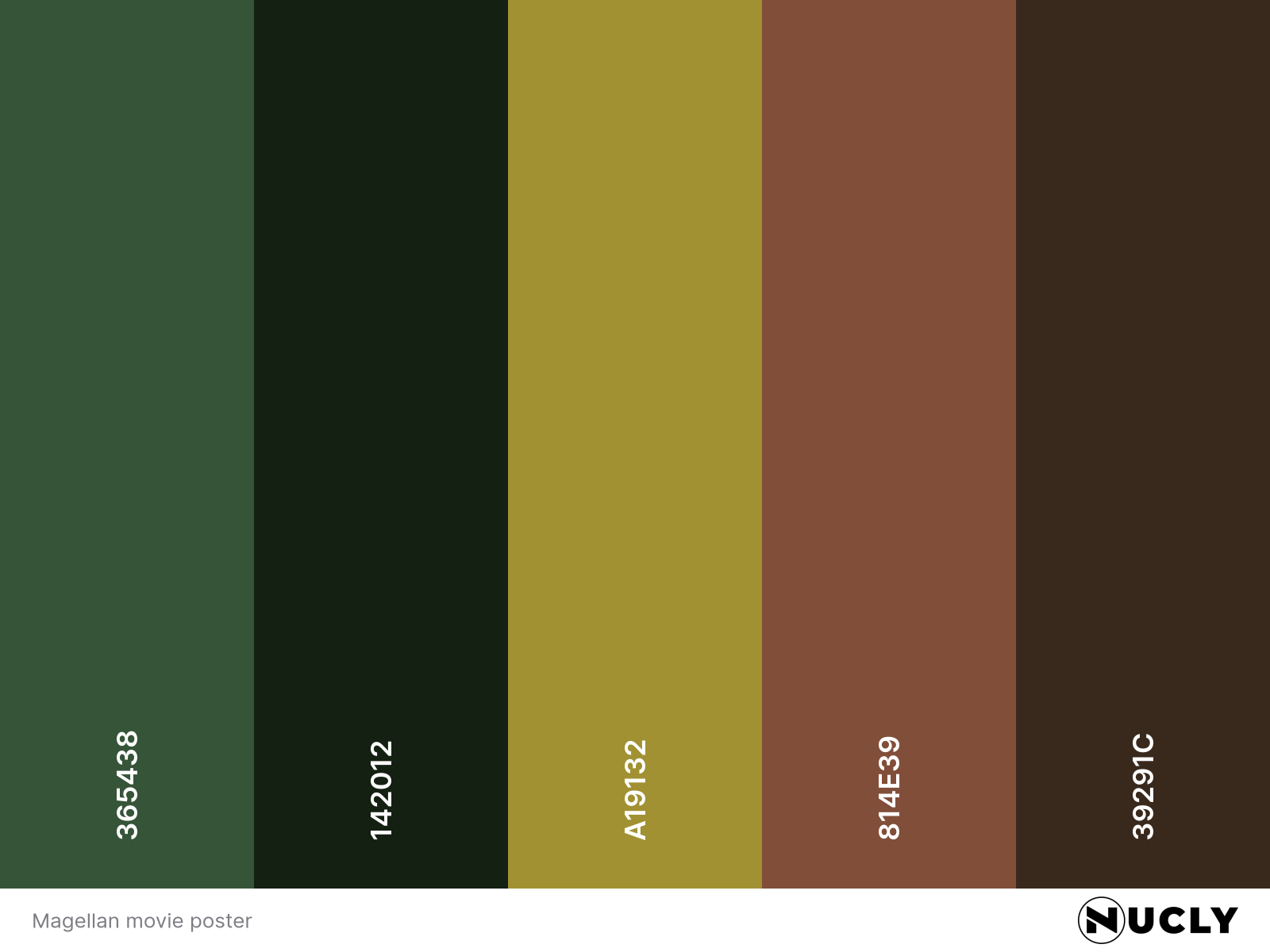
Lost in the Green Canopy

Artwork: Poster for Magellan
Color Harmony: Split Complementary
Key Color: Green
Link to Palette: Colors on coolors.co
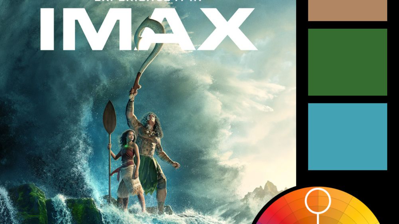
This week’s poster is Magellan, a quiet, contemplative piece that leans into a split complementary harmony with green at its center. The supporting colors—a desaturated red and warm beige—are subtly worked into the skin tones and wardrobe, giving the image an organic, grounded tone that mirrors the setting.
The visual reminds me of the Jasmine composite from the Photoshop Masterclass. It’s not just the tones, but the way the surrounding leaves are used to frame the subject—an effective way to add depth and isolate the figure against an otherwise flat backdrop. It’s a soft, painterly treatment that sells the introspective tone of the film without needing to shout.