It's a Kodak Moment
Artwork: Poster for Heel
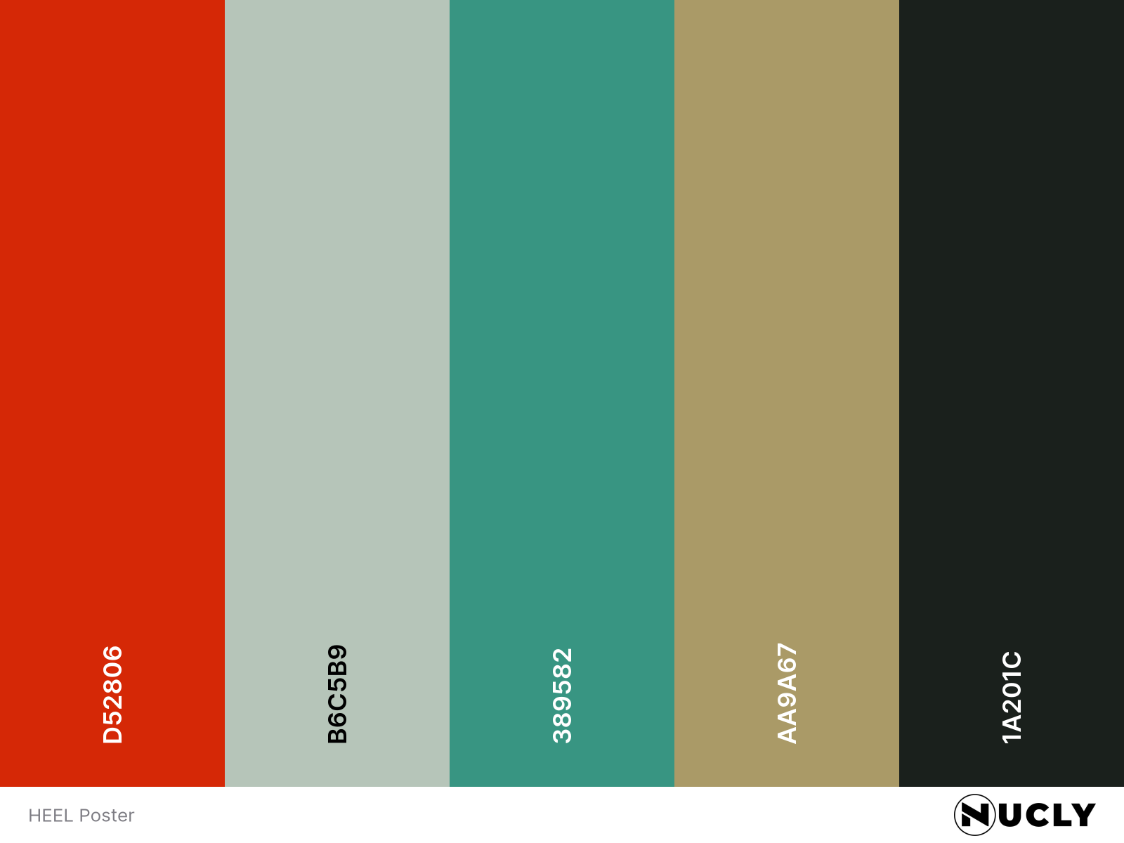
Color Harmony: Split Complementary
Key Color: Red
Link to Palette: Colors on coolors.co
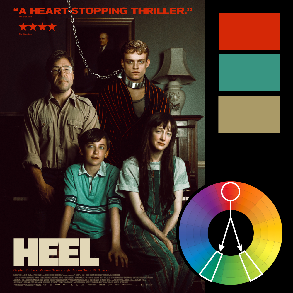
This week’s featured artwork is the poster for Heel, which uses a split complementary harmony with red as the anchor—most notably in the review blurb and the bathrobe stripes of the central character. The supporting hues are a muted aqua and a washed-out olive that feels lifted straight from a sun-faded 1970s family photo.
That’s no accident. The entire composition plays on the trope of awkward posed portraits, with a “happy family” arrangement that slowly collapses under closer inspection. The chain. The collar. The expressionless faces. The contrast between palette and content creates exactly the kind of quiet unease the poster wants you to sit with. It’s not screaming horror—but something’s off, and you’re meant to notice.