How to Make a Color Scheme

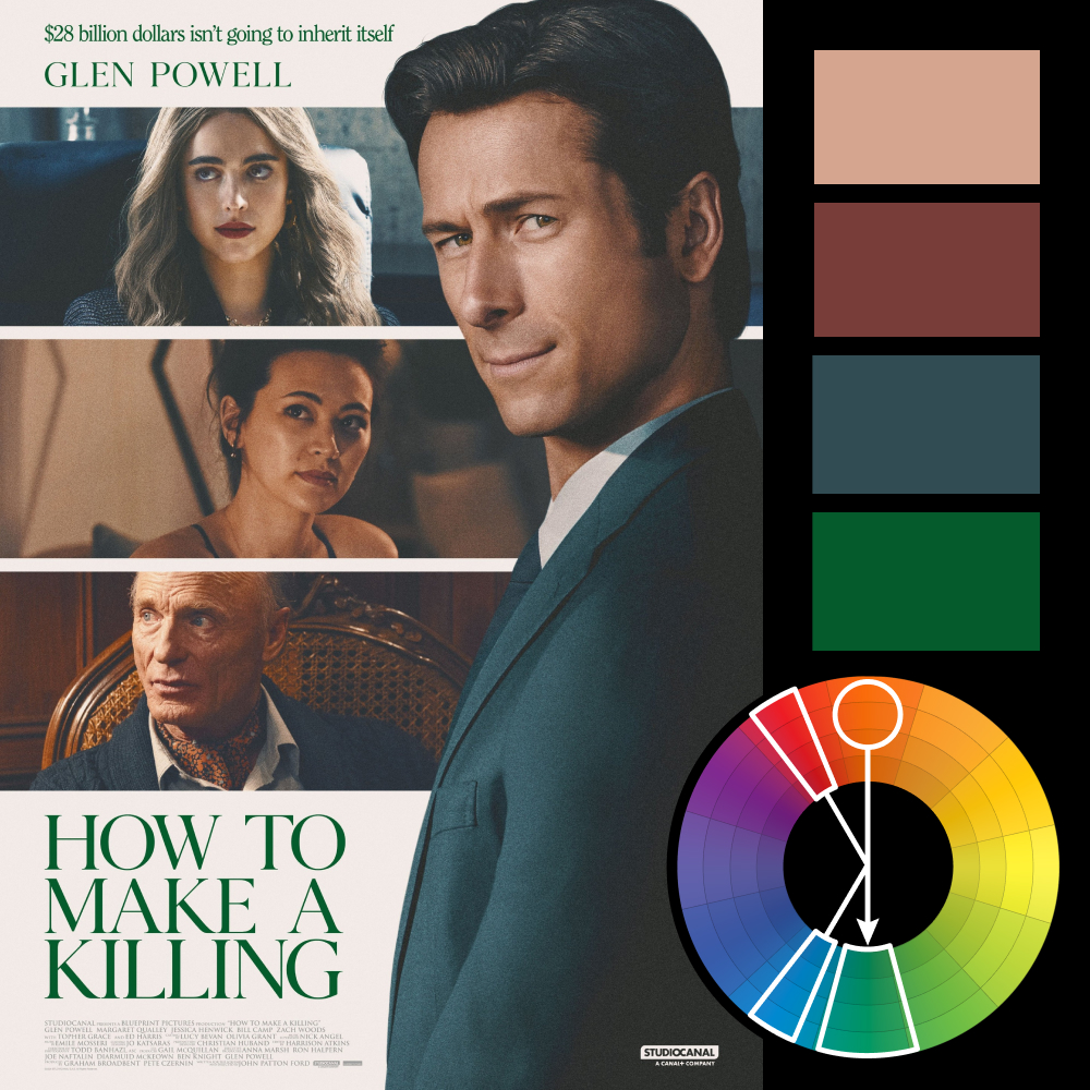
Artwork: Poster for How to Make a Killing
Color Harmony: Asymmetrical Split Complementary
Key Color: Skin Tone
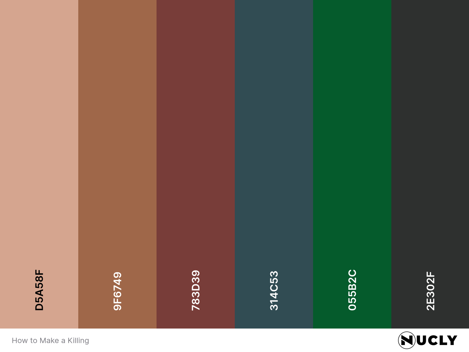
Link to Palette: Colors on coolors.co
This week’s artwork is the poster for How to Make a Killing, a retro throwback that leans hard into its analog aesthetic. From the matte blacks to the muted wardrobe choices, everything feels late '80s/early '90s—like it belongs on a dusty VHS box on the shelf of your local video rental.
The palette follows suit. Skin tones serve as the key color, with a sharp green in the title providing contrast and bite. Instead of the typical split complement, this is an asymmetrical take—one supporting color hugs the complement (a cool desaturated blue), while the other skirts the edge on the key color’s side. It’s a subtle deviation that adds complexity without straying from the retro brief.


