Across the Cool Divide

Artwork: World of Warcraft Key Art by Bayard Wu
Color Harmony: Analogous
Key Color: Blue
Link to Palette: Colors on coolors.co
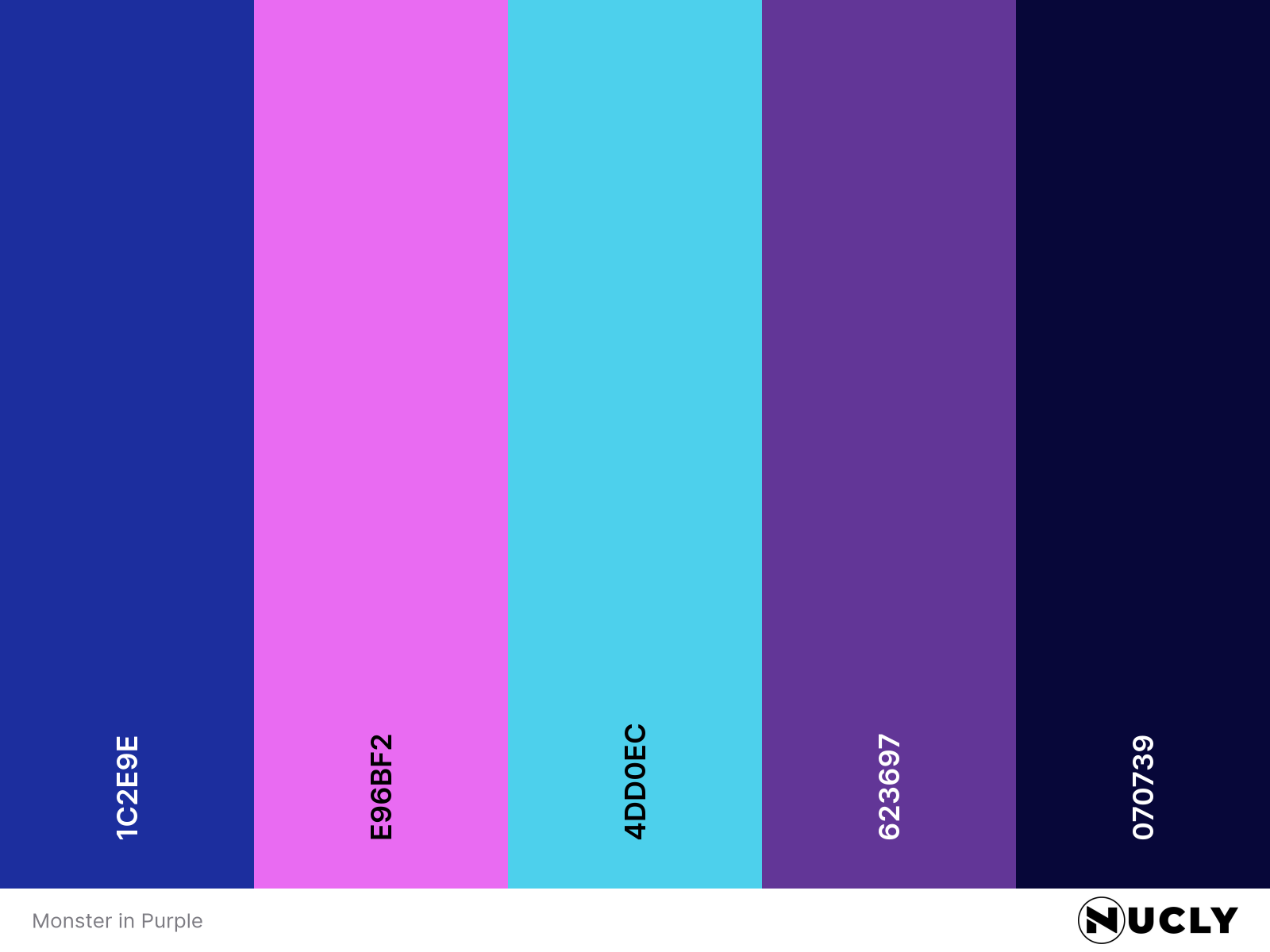
This is how you do analogous without falling into monotony. Most of the image lives in a deep, galactic blue—bold, moody, and atmospheric. But the addition of cyan pushes the range toward cool brightness, while the magenta edges just into the warm side of the color wheel.
That small step into warmth changes everything. It keeps the palette from feeling flat or frozen, and instead gives it energy, dimension, and drama. What could’ve been cold becomes cinematic. That’s the trick with analogous color: it comes to life when you let it cross the line.


