A Solar Sign in Split Complementary
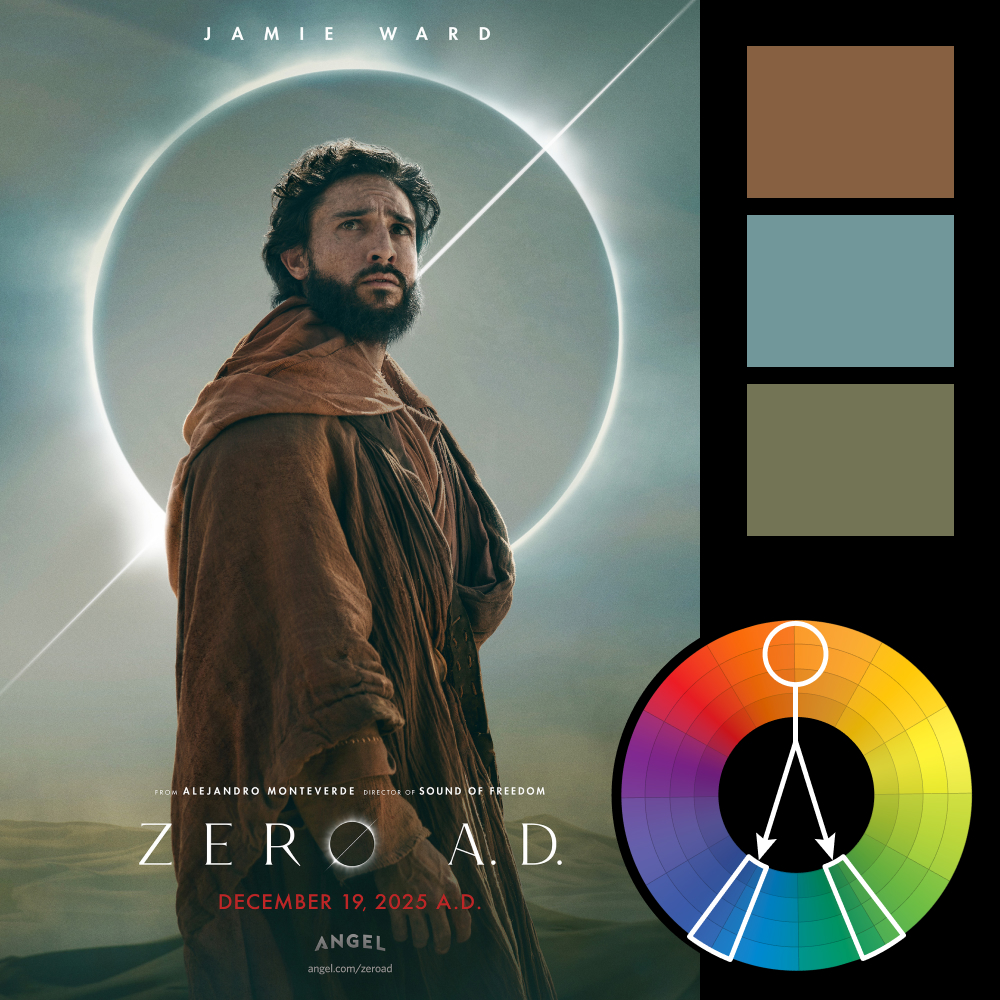
Artwork: Zero A.D. movie poster by Bond
Color Harmony: Split Complementary
Key Color: Desaturated Orange (Brown)
Link to Palette: Colors on coolors.co
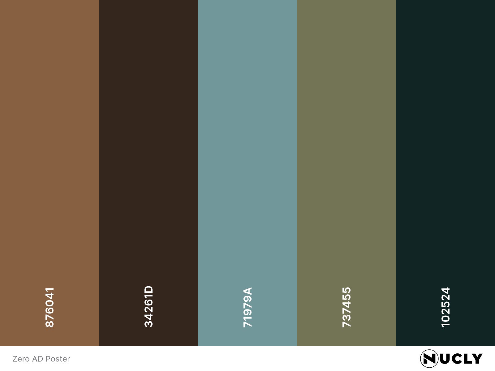
This character poster for Zero A.D. uses a muted split complementary harmony built around a desaturated orange—rendered here as earthy browns in the robe. Supporting tones of faded blue and olive green add a weathered, ancient feel that suits the subject matter.
The color palette feels grounded and serious, yet the composition brings a touch of the celestial. The solar eclipse isn't just a backdrop—it’s used as a storytelling symbol and echoed graphically in the title itself. It’s a subtle but powerful fusion of tone, story, and design.

