A shadow in the warmth
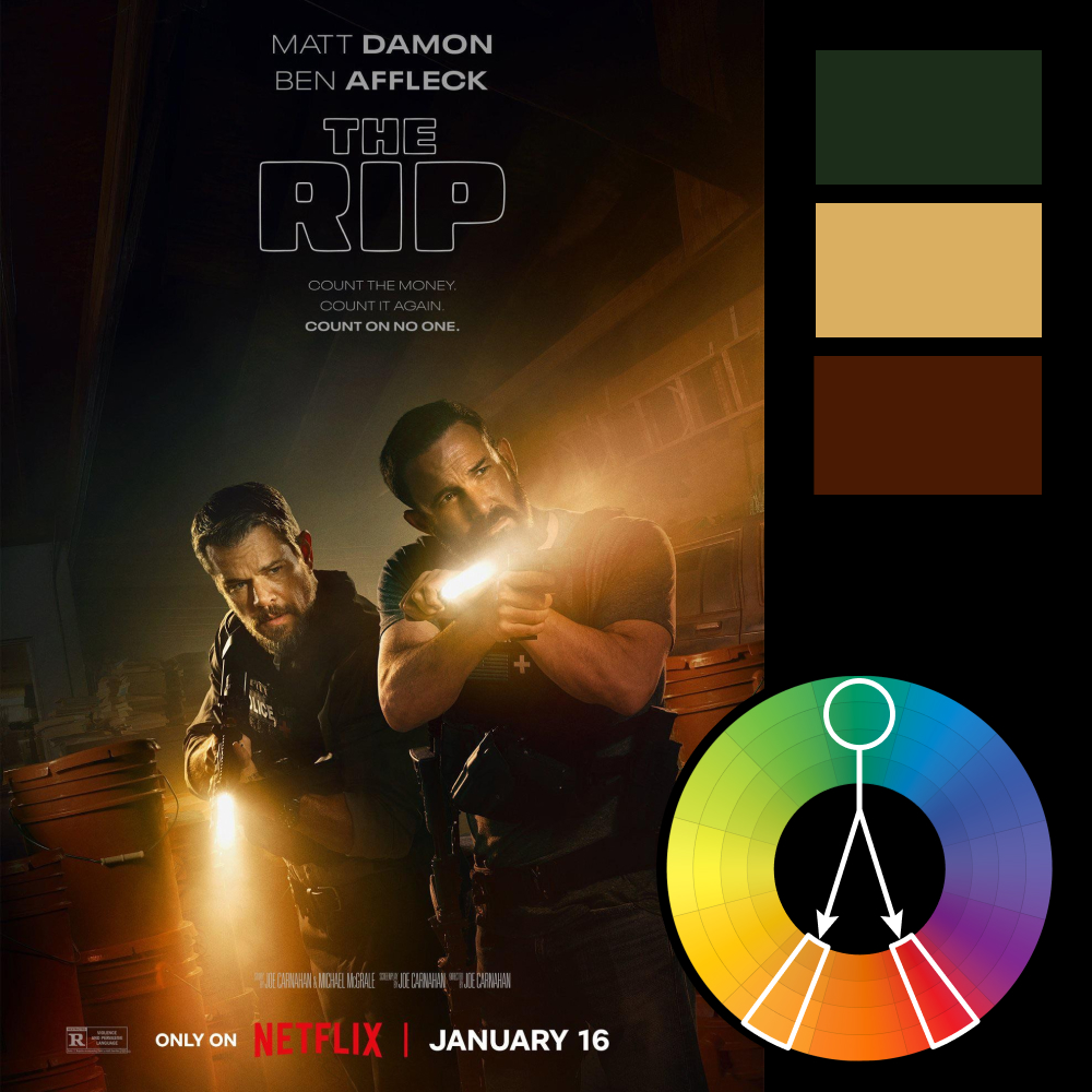
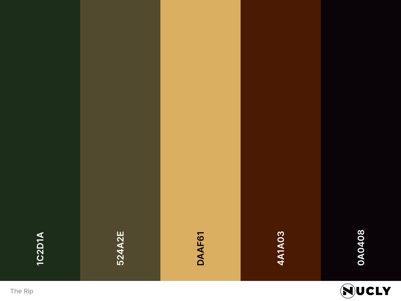
Artwork: The Rip – Movie Poster
Color Harmony: Split Complementary
Key Color: Burnt Orange
Link to Palette: Colors on coolors.co
At first glance, The Rip leans into the warmth—its palette is steeped in amber light, rich mahogany shadows, and the kind of golden glow you expect from a heist lit by flashlights and flickering fluorescents. It reads like a classic warm analogous scheme, anchored in browns, beiges, and golds.
But then there's the green. A small but deliberate patch of forest green sits squarely in the center of the frame—on Ben Affleck’s shoulder. It’s subtle, nearly swallowed by the shadows. And yet it’s just enough to shift the balance. That single hue breaks the warmth and reframes the image as a split complementary harmony.
It’s a clever use of color theory to control the eye. Amidst all the heat and tension, the green grounds the poster—directing your focus, adding contrast, and hinting that not everything in this world is what it seems.