A cold palette with a warm pulse
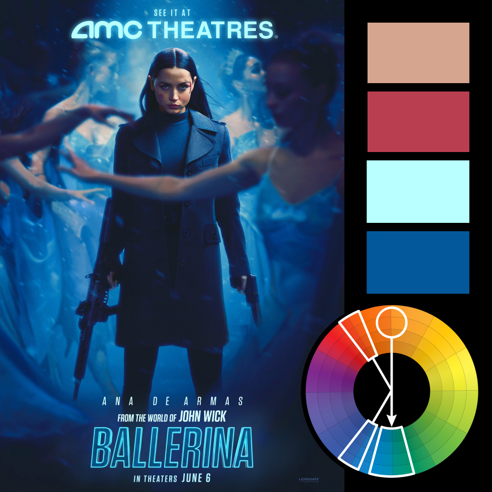
Artwork: Ballerina Movie Poster by AV Print
Color Harmony: Compound
Key Color: Skin (muted peach)
Link to Palette: Colors on coolors.co
This week’s poster for Ballerina (from the world of John Wick) introduces a harmony we haven’t covered yet: compound color harmony.
A compound harmony is a variation of split complementary, but instead of placing two complements directly opposite your key color, it shifts them, so that there is a complements next to both your key and opposing colors. The result? A palette that feels grounded but more cinematic and nuanced than a direct complementary scheme.
Here, the warm skin tone takes the lead, with the red of the blood next to it. On the other side, the strong aqua dominates the title, with a true blue filling out the entire background of the poster. These subtle choices are what give the image its tension: emotionally cold, but pulsing with something warmer just beneath the surface.